
End of year lists are a bane of the internet, wherever you look websites up and down the land are pulling together round ups of their favourite things of the last 12 months, cynically packaged up to get readers debating and dissecting their choices in search of some traffic in the fallow festive period. We’d love to say we’re better than that, but we’re really not, so here it is – the DEFINITIVE list of the 25 best rugby shirts of the 2014/15 season!
Before we crack on, some housekeeping – to be eligible for this award, the shirt in question has to have been released and worn during the 2014/15 northern hemisphere rugby union season, 2015 NRL and Super League seasons, the 2015 Super Rugby season or the Rugby World Cup. No other shirts are eligible, so don’t go moaning at us because we’ve missed out shirts that were either released in 2013/14, or 2015/16!
We reviewed over 250 shirts – 250! – in the period covered, so competition was truly fierce and many nice shirts didn’t make the cut, but here you have it, the best of the best, the 25 best shirts of 2015…
25 Pampas XV Away
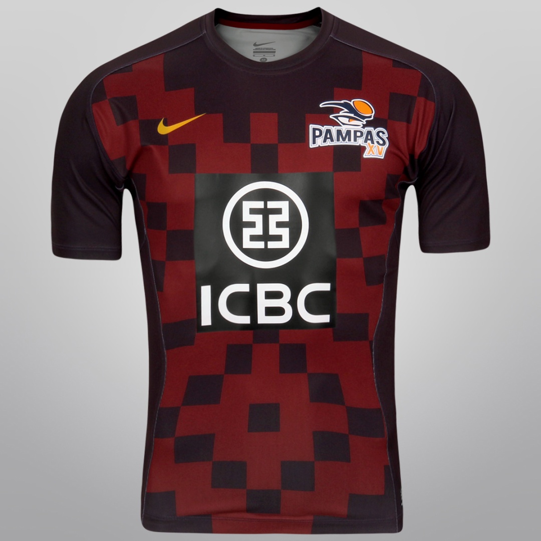
The real shame about this shirt for Argentinian development side Pampas XV is that more people didn’t get a chance to appreciate it. Pampas XV competed in this year’s inaugural Pacific Rugby World Championship, and lifted the title, beating Fiji Warriors in the final.
As with many Nike designs, this is an unabashedly modern shirt, with a very cool square-based pattern. The home shirt was nice enough, but the ‘port wine’ coloured change shirt just pips it.
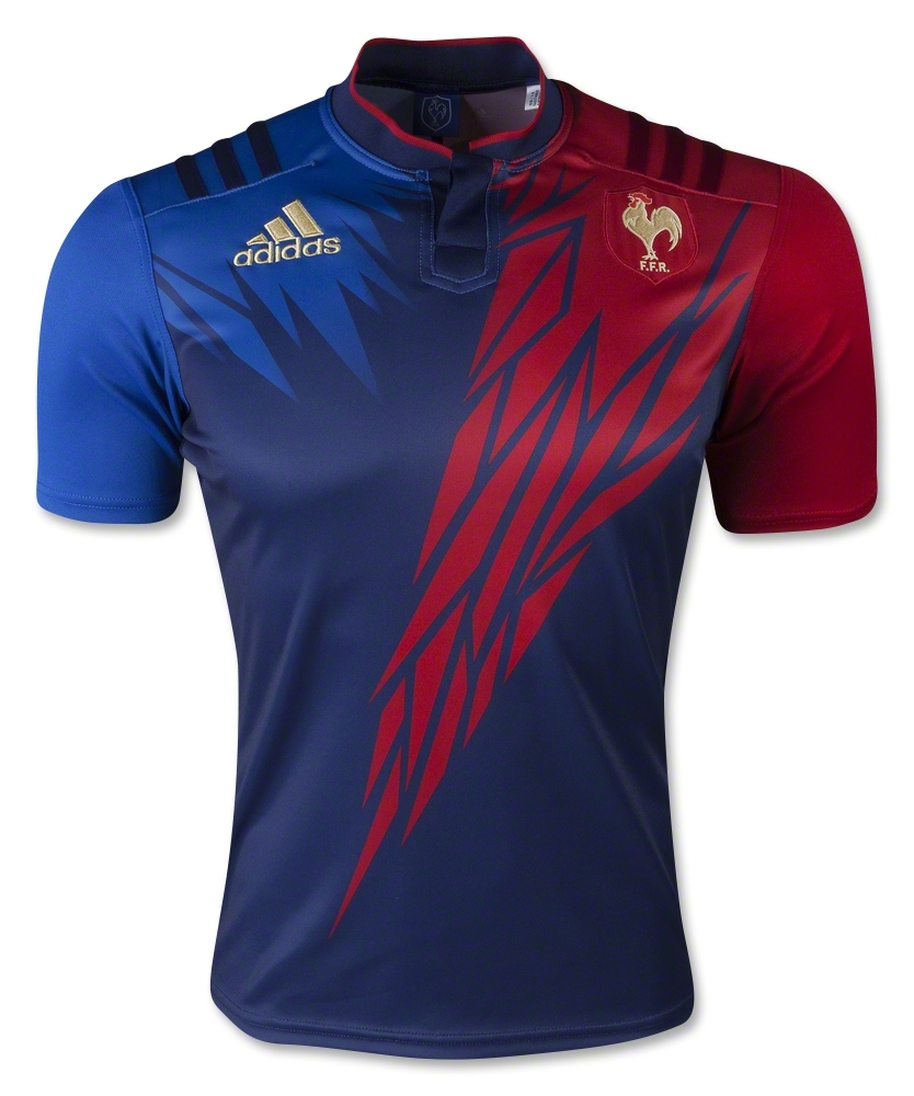
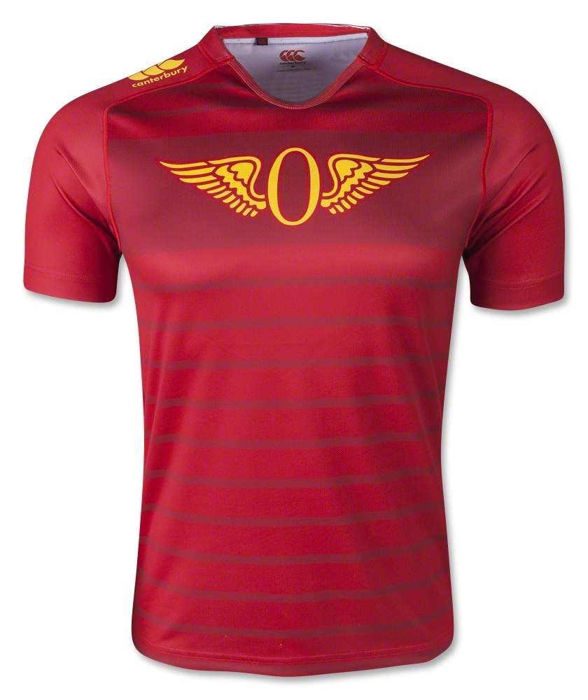
24 France Alternate
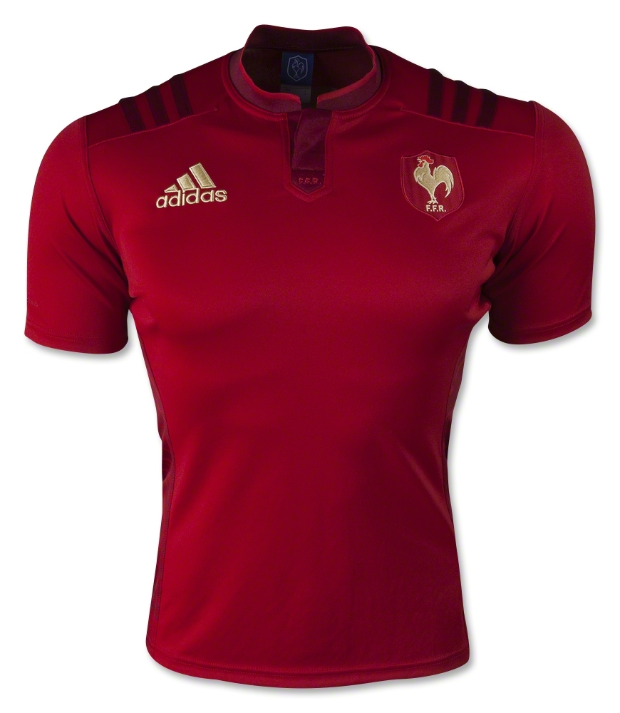
Les Bleus broke from nearly 60 years of tradition by bringing back red as their alternate colour in 2015, and while it raised eyebrows in some corners, it was hard not to enjoy what Adidas did with it, the monochrome shades of red broken only by the striking gold of the FFR badge and the Adidas logo.
The ‘wings’ on the back were perhaps a little tacky, and the performances of the players wearing them were best forgotten, but never let it be said that this wasn’t a very cool, very distinctive design for the French.
23 Canterbury-Bankstown Bulldogs Away
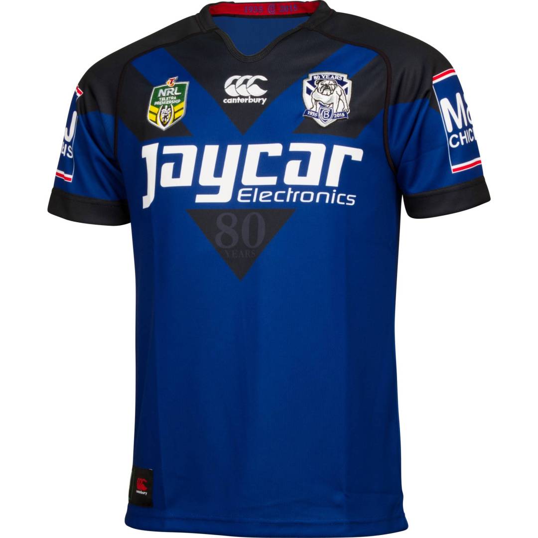
Our first entry from the NRL is a beauty, and a fitting way for the Bulldogs to celebrate their 80th year. This jersey is a nice twist on the classic rugby league double chevron, which in itself is an undeniably beautiful thing, but it’s the colours that really set this shirt apart. Deep royal blue and black work so well together, it creates a jersey that just oozes class. Nice.
22 Central Cheetahs Away
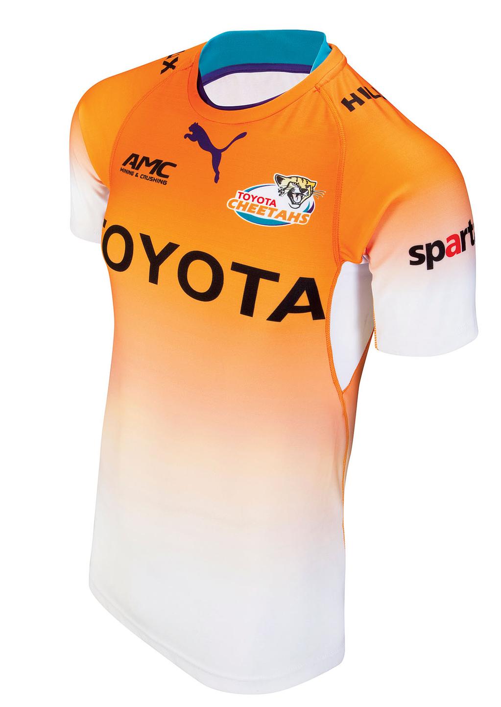
Another change shirt, and this time it’s our first entry from Super Rugby. The Cheetahs might not be a force on the field, but their striking Puma jerseys definitely catch the eye. After a few years of fairly boring plain orange-with-white home shirts for the Bloemfontein franchise, but in recent years Puma has done some really bold, unusual things.
This is perhaps the most striking yet, with an ultra-modern white-to-orange fade nicely accented by the super-unusual combination of aquamarine blue and deep purple – who knew that could work, eh?
21 Wests Tigers War Machine
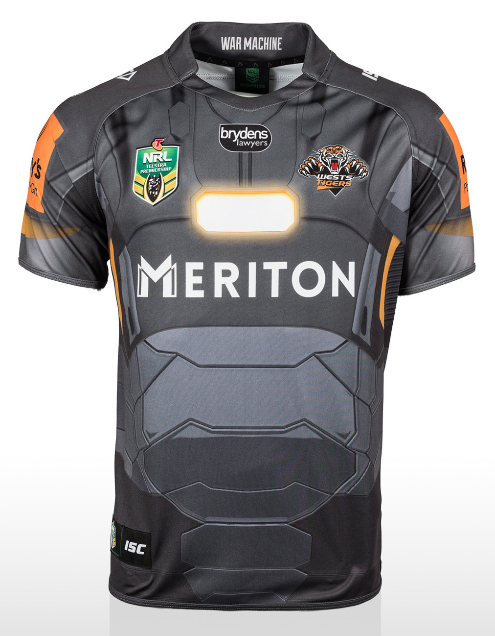
The Marvel Heroes shirts are some of the most unconventional and talked about rugby shirts we’ve ever featured on Rugby Shirt Watch, and in truth, we could have picked any of their awesome superhero-inspired designs to include on this list.
The Tigers’ shirt just pips it however, as we love the way the club’s orange colour has been subtly included into the War Machine design, making it feel very much a Wests shirt, as well as a Marvel one.
20 France Sevens Home
A confession – the first time we saw this shirt, we thought it was utterly hideous. And yet somehow, it grew on us in ways we never expected. We love Sevens shirts because they’re intentionally gaudy, unconventional and downright bonkers, and this one surely fits the bill.
We have no idea what’s going on with the weird jagged icile-type pattern here. Are they supposed to be feathers? Shards? We have no bloody idea, but it looks absolutely rad – more of this please!
19 Ireland Home
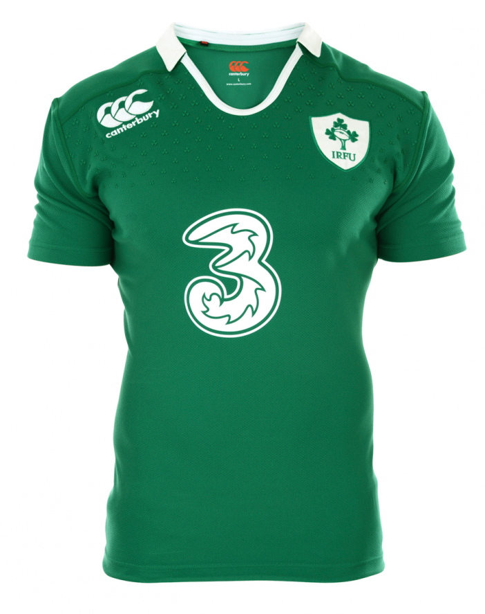
Ireland and Canterbury were reunited after a few years apart this season, and they came back in the best possible way with an absolutely stunning home shirt that showcased everything we loved about Canterbury’s design philosophy.
The modern little details were there of course, such as the shamrock grip material across the top of the chest, but that never detracts from an utterly stunning, retro-style design, complete with the crowd-pleasing proper collar – a rare move for Canterbury. Lush.
18 Queensland Reds The Flash
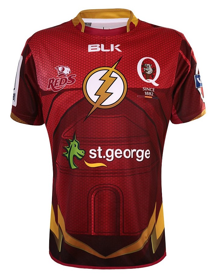
The second superhero jersey on the list, this time from Super Rugby, the Reds might have only worn this jersey for one game last season, but it deserved so much more.
Cleverly incorporating the look and feel of the Flash’s hallmark suit, including lightning bolt belt, with the basic Reds jersey design, it really was something a bit special – not even the ever-wretched St George and his silly dragon sponsor logo could ruin it.
17 Canterbury Home
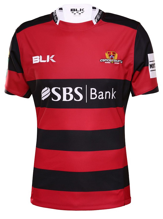
The subtlest of tweaks to the 2015 Canterbury ITM Cup shirt also lifted it to being one of the nicest, classiest designs in the NPC this year. Keeping the classic Canterbury black and red hoops was the best move, of course, but toning down the black in the sleeves and around the shoulders makes this feel more like a proper Canterbury shirt than several recent efforts have done. Classic.
16 Ospreys European
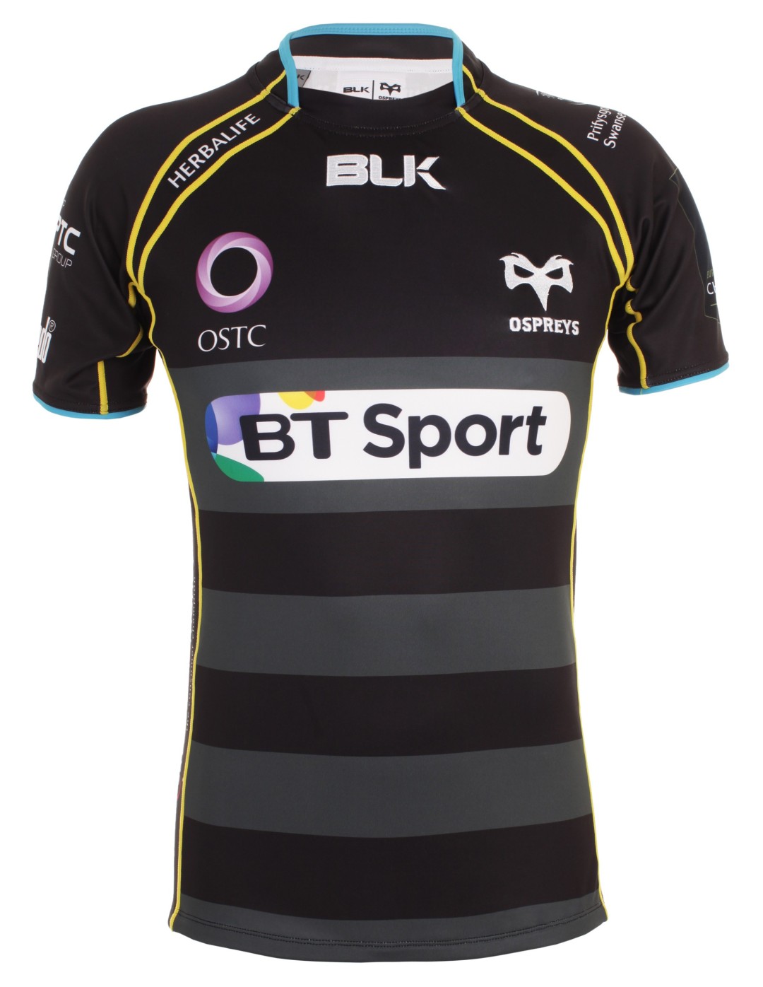
After a good but not spectacular start to their contract with the Welsh region, BLK absolutely smashed it out of the park with the Ospreys’ first European shirt. Keeping things clean and classy, they melded a really fetching black and grey hooped design with blue and yellow piping as a nod to the secondary colours being used last season.
We called it the nicest Ospreys shirt ever, and it’s a damn shame they couldn’t stick around in Europe longer so we could see more of it.
15 Stade Francais Home
Stade Francais signed off their long association with Adidas in 2014/15 with a surprise Top 14 title win, and they also marked it with one of the most strikingly awesome home shirts in the club’s long tradition of crazy shirts.
Taking things back to the roots of lightning bolt-themed shirts, the design plastered pink and dark blue bolts all over the design in a fitting tribute to the revolutionary designs the pair had produced together.
14 Melbourne Storm Away
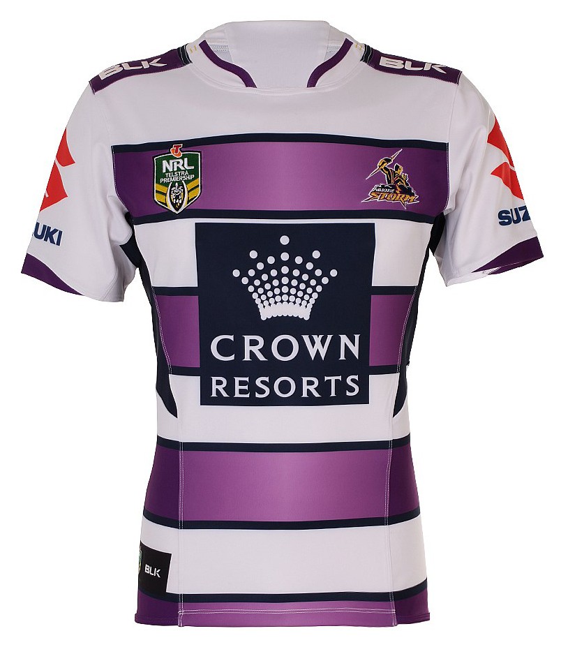
The Storm have one of the most distinctive looks in the NRL with their purple home shirts, but this alternate design, with it’s unabashedly modern and yet somehow still classic white and purple hoops really steals the show. One of the most eye-catching shirts in any code this year.
13 Old Mission Beach Athletic Club

Proof that you don’t have to be a top flight team to rock an utterly gorgeous, unique shirt, the USA’s Pacific Rugby Premiership might be playing second fiddle to the new PRO Rugby professional tournament in the States from 2016 onwards, but they’ll be hard pushed to top the PRP’s ratio of stunning Canterbury shirts.
Old Mission Beach had one of the coolest, a subtle, classy number that matches a plain blue front with distinctive and ice-cool striped sleeves and shoulders. Punching so far above their station.
12 Italy Alternate
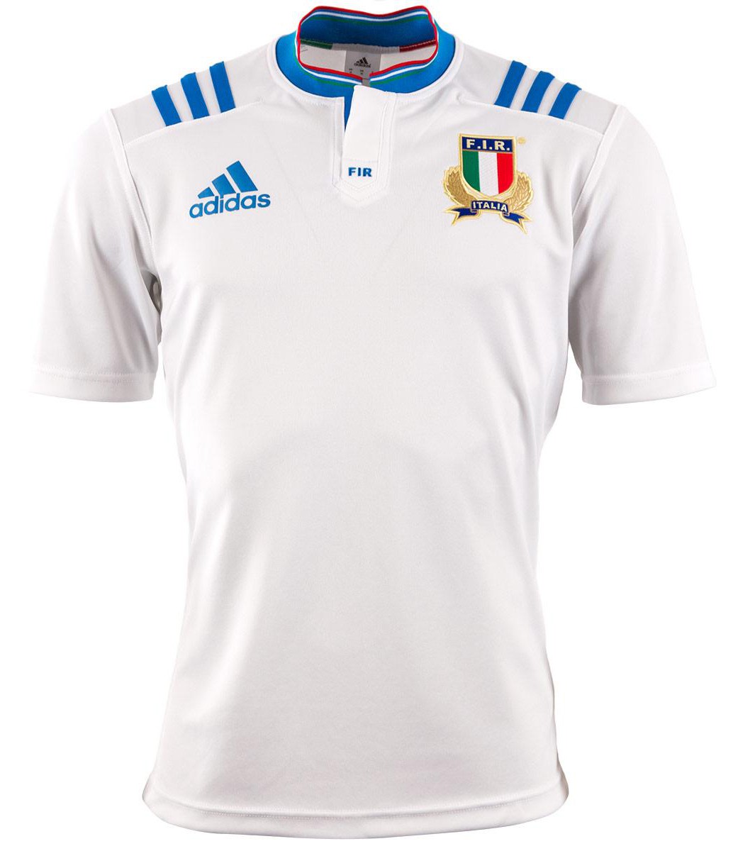
One of the biggest crimes of Italy’s meh World Cup shirts were that they replaced some utterly beautiful non-RWC designs that had barely been worn a half-dozen times. The home was lovely enough, but the away was a work of art worthy of the Masters.
And exercise in elegant simplicity, the charm really is in the details here – the beautiful way the light blue accents work to accentuate the white, the colours of the Italian flag pinstriped around the collar… it’s really is pure class.
11 Sydney Roosters Auckland 9s
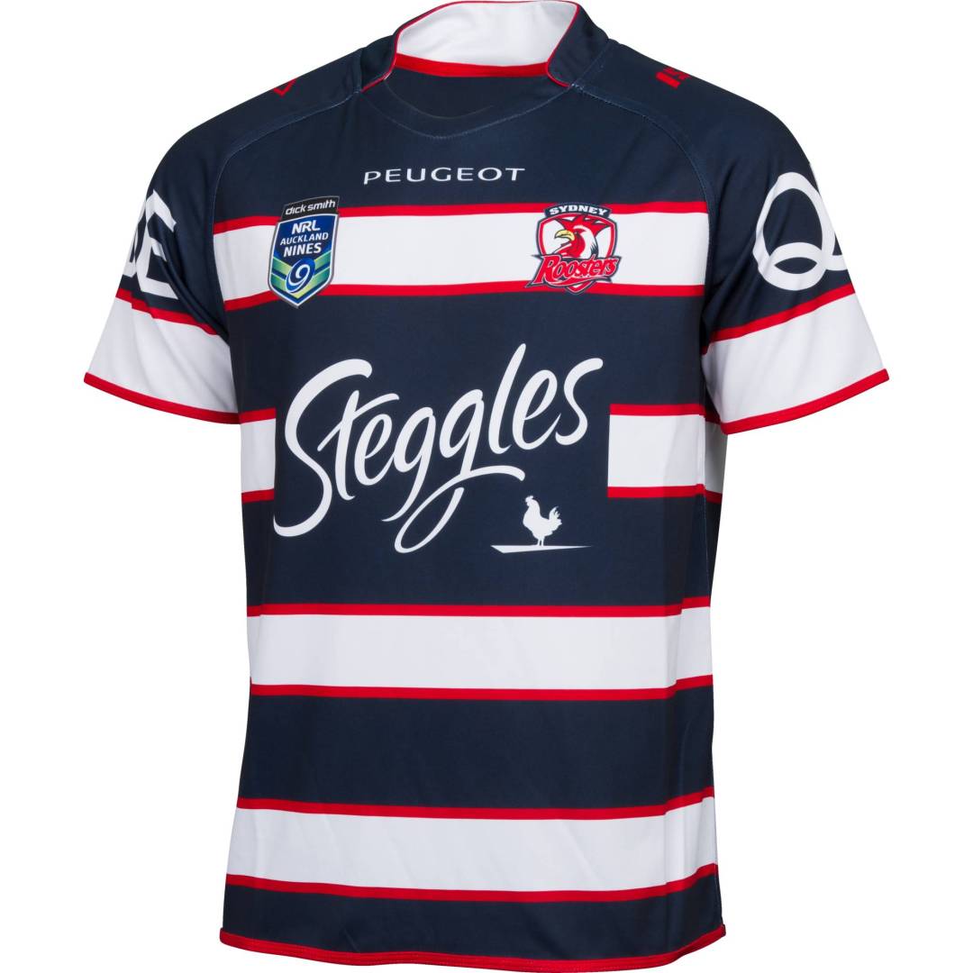
Like its cross-code cousin Sevens, the Auckland 9s tournament is usually the place where NRL teams take their already wild and wacky jerseys to even wildier and wackier extremes.
The Roosters don’t really go for wild or wacky, however, and instead they produced a 9s shirt that was classy, elegant and simple… did they not get the memo? Regardless, it’s a lovely jersey, with the red pinstripes that separate the larger hoops a really cool touch.
10 London Irish St Patrick’s Day
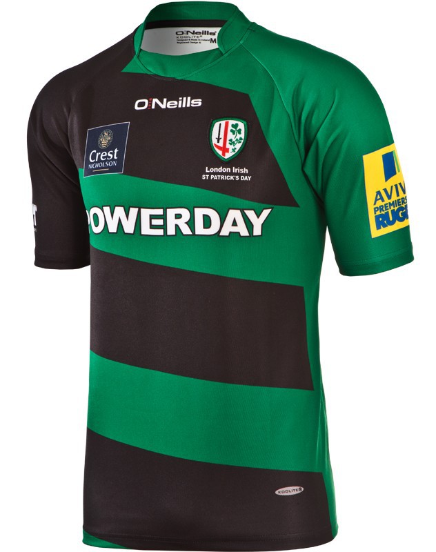
When O’Neills announced their arrival as London Irish suppliers with three of the blandest shirts we’ve ever seen, we were pretty underwhelmed to say the least, and we weren’t really expecting much from the club’s annual St Patrick’s Day game jersey either.
How wrong we were. With it’s awesome combo of green and black, strikingly modern yet still classy and clean diagonal hoops, and contrasting black and green sleeves, it was a shirt that pointed the way the good things the Irish supplier could achieve…
9 England RWC2015 Home
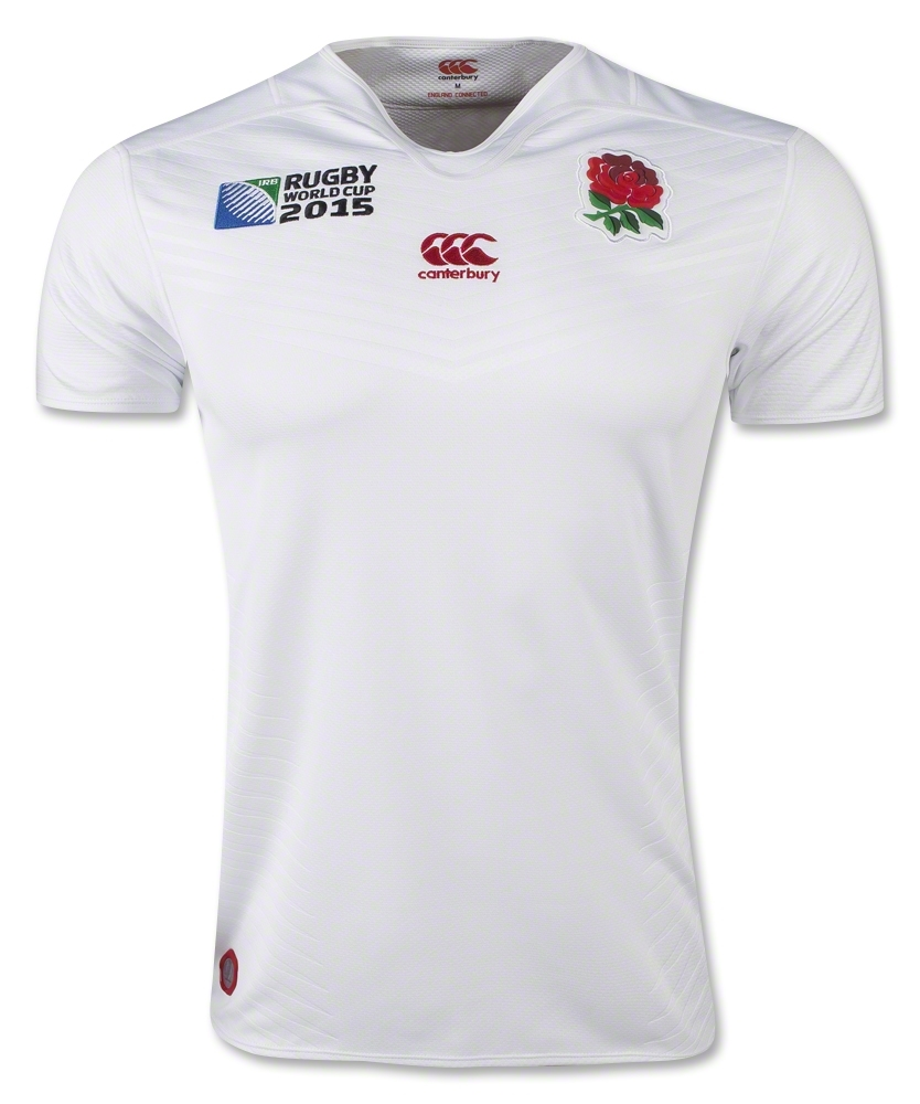
The tournament might not hold very fond memories for England fans, but we can’t let that get in the way of the fantastic job that Canterbury did with the shirt. Creating something that was both classic and modern is no mean feat, but CCC are the masters at this kind of thing, and nailed what is probably one of the most important shirts the company has ever produced.
The clean basic look is augmented by the chevron’d grip material on the chest, while the incredible 3D injection-moulded badge is one of the coolest design features we’ve ever seen on a rugby shirt.
8 Japan RWC2015 Home
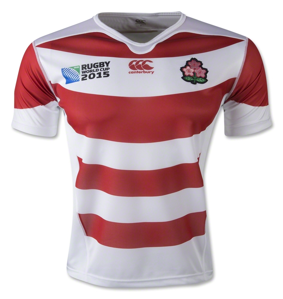
Forget Kardashian arses, this is the rugby shirt that broke the internet. In the days and weeks following their remarkable triumph over the Springboks at the World Cup, the Japan shirt became the hottest property in the rugby world. Retailers across the globe sold out almost instantly, and rumours flew of them going for inflated prices on eBay.
It also helped that it’s an absolutely gorgeous shirt – another really cool take on the hooped design by Canterbury, with the slight curve subtly reminding you of Japan’s ‘circle of the sun’ flag. The alternate shirt was equally, if not more gorgeous, but suffers from the fact that it was never worn. Boo.
7 Wales RWC2015 Home
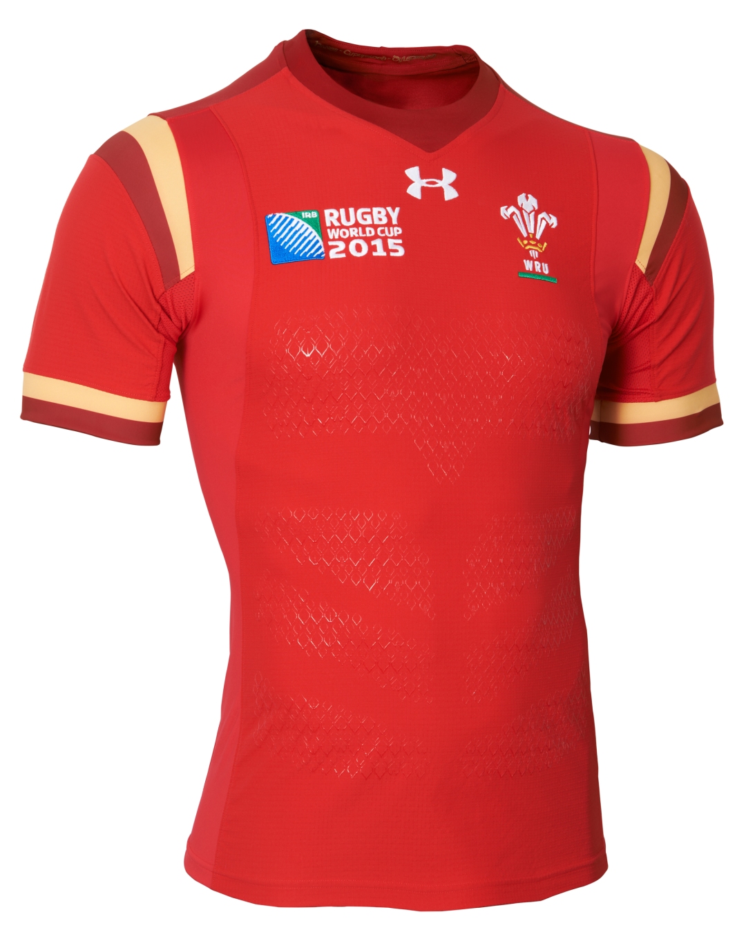
One of the most controversial shirts at the World Cup, there was outrage among some fans at Wales breaking with tradition by including gold and oxblood in their new design.
That conveniently overlooked the fact that it was stunning, unique and beautifully thought through, of course, but once Wales started winning in it, particularly a famous win over England at Twickenham, the complaints promptly dried up and soon the doubters were embracing the shirt and the players doing it proud.
6 New Zealand Warriors Home
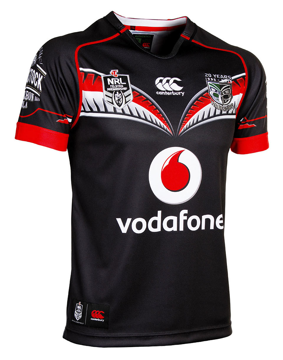
The Warriors are famed for their boundary-pushing shirts, even by the NRL’s already pretty far out standards, but for their 20th Anniversary in 2015, the Warriors opted for a home shirt that was clean, classy, but packed with cool details.
The black, red and silver looks undeniably rad, but the highlight has to be the red and silver ferns across the chest, which put a uniquely New Zealand slant on the traditional rugby league chevron.
5 Samoa RWC2015 Alternate
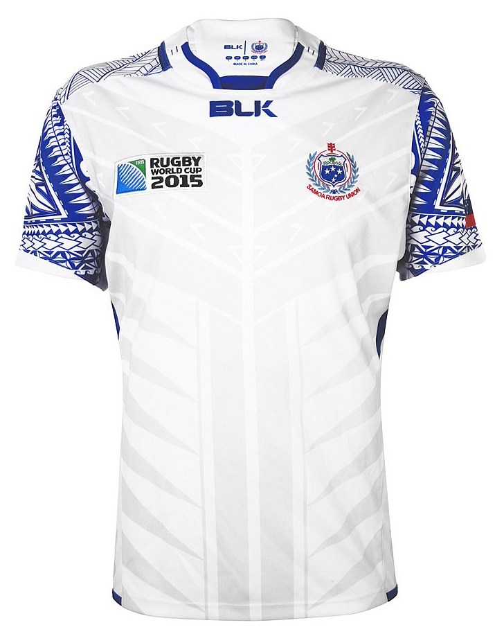
BLK might not have supplied the most high-profile teams at this year’s World Cup, but the Australian brand excelled at drawing on the culture of these smaller nations to create totally unique and interesting jerseys, and the Samoa design might just be the most memorable of the lot.
Beautiful in either its home or change variants, we always preferred the alternate design, because the blue-on-white colour scheme allows the incredibly intricate tribal patterns on the jersey sleeves to really stand out. The pre-RWC shirt worn for their historic test against the All Blacks showcases all that detail even more, but we like the restraint shown here.
4 All Blacks RWC2015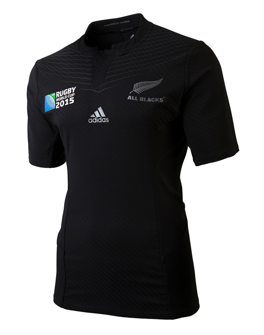
Had to be, didn’t it? The double world champions are also wearers of perhaps the most iconic shirt in all of sport, and their 2015 World Cup shirt brought an extra dimension to the pre-tournament ‘blackest jersey ever’.
Fittingly for a World Cup staged in England, the All Blacks opted to pay tribute to the famous 1905 New Zealand team who were the first to be called All Blacks, the ‘Originals’. The Originals’ shirt was black with a white chevron across the shoulders, and while this isn’t quite so stark, the chevron design is a cool modern way to reflect that. One of the nicest, most interesting All Blacks shirts in years.
3 Argentina RWC2015 Home
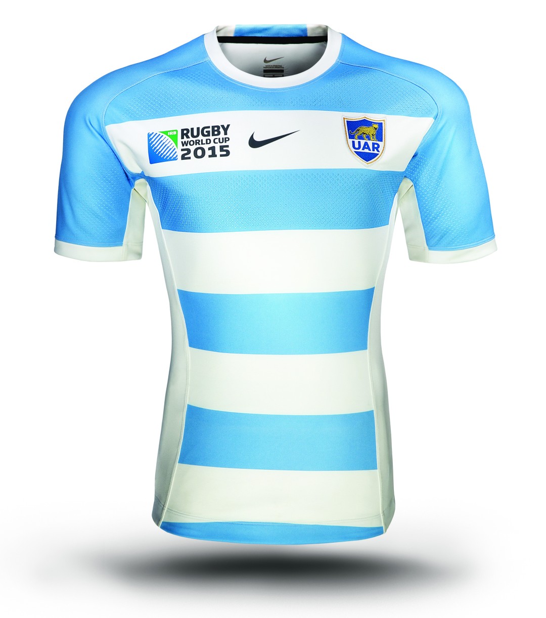
We christened this shirt the best of the Rugby World Cup, and in truth it wasn’t something that we had to deliberate about for that long. Nike doesn’t make too many rugby shirts these days, but they’re still produce some of the coolest designs around.
While they’ve generally favoured more modern, out-there designs in recent seasons, this was something else entirely – Nike showing that it can do classic, retro-modern shirt design as good if not better than anyone else out there today. The traditional hoops, the modern touches of the white side vents and the blue that encompasses the sleeves and shoulders… it’s just a stunning design.
You lot clearly thought so too – Nike had no plans to sell a replica of this jersey outside of Argentina, but such was the reception for this design, and the mad clamour to get them, the US giant relented and offered a limited number to global retailers. That they sold out almost instantly was no surprise at all.
2 Olympic Club RFC
 If you’d have told us at the start of 2015 that by year’s end we’d be putting the shirt of a small American rugby club that we’d never even heard of as the second best design of the season, we’d have probably laughed our asses off.
But the Olympic Club RFC shirt was no laughing matter. Small time Olympic Club RFC might be – they’re comfortably one of the smallest, most insignificant clubs we’ve ever covered here on Rugby Shirt Watch – but Canterbury has produced a shirt for them that’s not just brilliant, it’s an all-time classic.
The branding helps of course – there’s something wonderfully old-school and cool about the striking winged O that dominates the front of the jersey, and with no sponsors to be seen, it’s allowed to stand out even more. But that’s not all, the subtle pinstriping of dark red across the body is interesting and unique, and we love the way it expands to a single large red stripe behind the club crest.
There are quite literally hundreds of professional teams out there that haven’t ever worn a jersey as nice as this, and for Canterbury to produce something quite this stunning for a club that probably gets no more than a few hundred spectators and no TV cameras at their games is pretty remarkable.
In any other year, the Olympic Club shirt, one of the nicest designs ever, would have won shirt of the year at a canter, however, this is no ordinary year…
1 Argentina Pumas 50th Anniversary
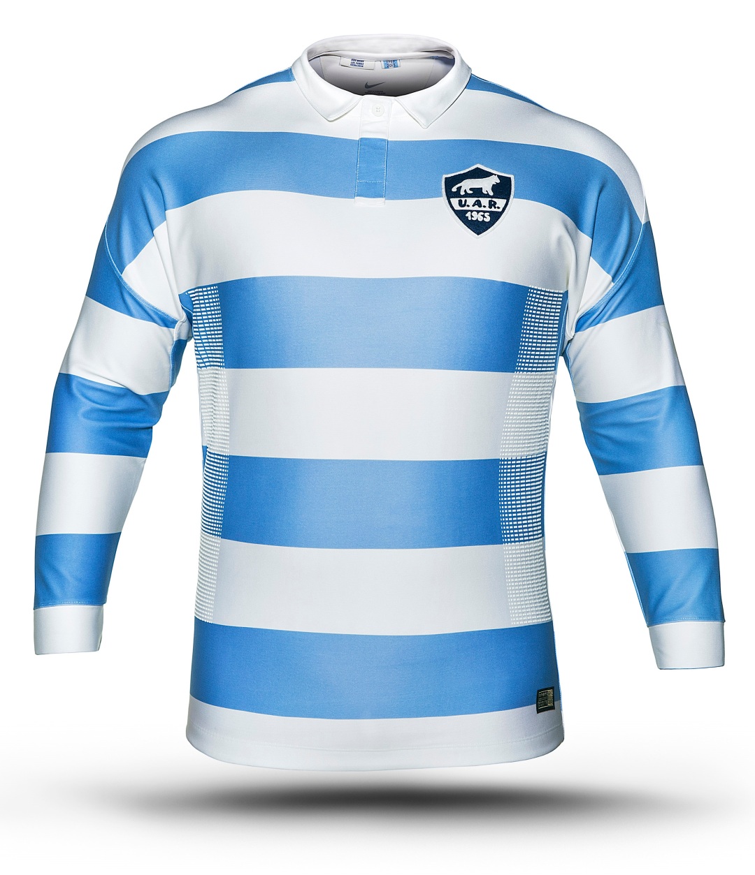
When Argentina decided to mark the 50th Anniversary of the Pumas name and their first overseas tour for their two tests against South Africa with a special jersey, we were entirely unprepared for the magnificence of what the designers at Nike would come up with. Quite simply, one of the most stunningly faithful, beautiful and remarkable retro-inspired shirts ever.
A modern rugby shirt in fit and build, it nonetheless looks as if its been pulled through a time portal from 1965. And with good cause – Nike’s designers travelled to Argentina and to the rugby museum in Buenos Aries and studied the original 1965 shirt up close, even chatting to some of the players who travelled on that first Pumas tour.
The result was a shirt that fuses modern jersey technology and materials with the look and vibe of the classic rugby shirts that are still beloved by rugby fans the world over. The long sleeves, the fold-down collar, the button-up placket, the subtly less bright shade to the blue… it all reminds you of a bygone era. Even the badge, modelled on that same 1965 shirt, feels authentically old – slightly rough, asymmetrical and hand-sewn, even though it’s not.
We’ve been incredibly fortunate to get hands on with one of the very, very few of these shirts in existence, and it’s a remarkable bit of kit – stunningly simple, elegant and classic, yet a proper modern shirt in every other way. It’s a reminder for us all of the power of simplicity, an iconic design, and a worthy winner of the Rugby Shirt Watch Rugby Shirt Of The Year 2015.


Couldn’t agree more with the number one choice, that thing is pornographic!