
After the advent of skin-tightness turned the first decade of the 21st century into a messy, ugly, multi-panelled period of rugby shirt infamy, the 2010s mercifully saw the art of the jersey make a real comeback.
Now, as we close the door on a time when rugby jersey designers have learned to blend classic and modern in new and exciting ways, what better way to sum up the last 10 years than by picking out the best designs of the decade…
Ireland 2014 Home
Canterbury’s first Ireland jersey after they won back the sponsorship rights is very likely their best, coming from a period when the brand was mining a rich seam of retro-inspired designs and interesting collar ideas.
The clean, 70s-vibed design had a unique low profile classic collar mixed with a large, deep loop, plus shamrock-shaped grip material as an extra classy touch. The only shame with this jersey was how little we got to see it – due to the RWC jersey being revealed in July 2015, it was only worn for a five-month period between November 2014 and March 2015.
Canberra Raiders 2015 Marvel
We’re not sure that the NRL realised quite what they were unleashing when they teamed up with Marvel to create a selection of superhero-inspired one-off jerseys in 2014. In the six years since the concept has crossed codes, countries and hemispheres, and become a polarising staple of the game.
The original is often the best however, and of those, the Raiders’ Incredible Hulk-inspired design was perfect not just because of the colour associations, but because of the innovative way the shirt used a ripped Raiders away jersey as part of the design, making the whole thing look much more natural and organic than the others.
France Women’s RWC2017 Alternate

The Women’s RWC 2017 was an important one for women’s rugby as a whole, but it also saw several of the big manufacturers create bespoke jerseys for the teams involved for the first time.
Adidas was no different, creating an alternate jersey for the French women that looked significantly nicer than the men’s version that came later. The innovative blue and red double chevrons look undeniably lovely, and without the shoulder stripes that would clutter the men’s version, it really was a case of nailing it first time.
Bath 2019 Away

A controversial pick given how polarising this shirt has proved to be, but we won’t here anything of it – it’s not only one of the most striking and stylish jerseys of the decade, it’s one that perfectly nods to the club’s heritage.
Effectively a straight modernisation of Bath’s much-loved 90s yellow away shirt, the three stripes on the sleeves and the asymmetrical collar are such striking but beautiful touches, we honestly can’t get enough of it.
England 2013 alternate

The nicest shirt England never wore? This wonderfully unique pinstriped red and white jersey was inspired by a painting that hangs on the wall of the President’s Suite at Twickenham, ‘The Battle Of The Roses: Yorkshire Vs Lancashire’ – which depicts a late 19th Century game between two of the game’s early powerhouses.
Compared to the usually meh or downright ugly, but this had real panache and cool… sadly Stuart Lancaster didn’t agree, and refused to allow England to wear the jersey during its lifespan, though it was worn by England women.
Castres Olympique 2014/15 Away

Kipsta is not exactly a brand who have torn up tress in the rugby shirt world – indeed the sub-brand of French sports retailer Decathlon was always a weird fit as a pro-sport supplier. But for one season at least, they did something beautiful.
The hooped jersey is always a thing of beauty, but here with the two shades of blue paired with a striking single white hoop… it still baffles us that nobody else has done this trick so successfully since.
Leinster 2014 European

Maligned at the time by many fans, we think that in the five years since this shirt should rightly be regarded as a bit of a classic of Canterbury and Leinster’s long and fruitful partnership.
The uneven thin hoops are really bold, but the striking gold bars across the middle really elevate it – a unique and instantly recognisable design.
Stormers 2014 Home
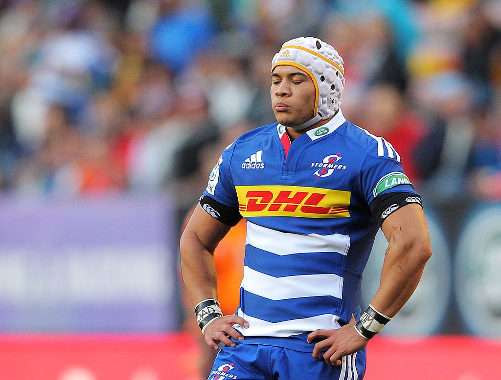
From one innovative and memorable twist on the classic hooped format to another, when Adidas decided to mix up the classic but ultimately a little tired look of the Stormers back in 2014.
The change was simple, but effective – taking the famous white and blue hoops of Western Province and chevroning them on the bottom half of the design, instantly making them feel fresh and contemporary.
Australia 2017 Indigenous
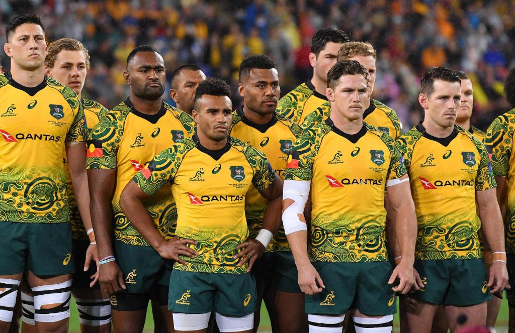
“Can we wear this every game?” that was the sentiment posed by Will Genia after the Wallabies debuted perhaps the most striking and unconventional test jersey ever against the All Blacks in 2017.
The ARU listened – bringing the shirt back in 2018 against England, and then adapting the pattern for the Wallabies RWC2019 alternate design, to a hugely positive reception. Not just a seriously cool jersey, but an important and symbolic one.
Ospreys 2017/18 home

For years the Ospreys drew attention to themselves with jerseys that blended black with a variety of gaudy and polarising contrast colours, and while those shirts were popular, there was a clamour among fans for something a bit more classy and restrained.
Canterbury’s first effort in 2017 did just that, and might have made the nicest Ospreys jersey ever in the process. Plain black with subtle white accents, including a clever ‘bedrock hoops’ motif on the sleeves, it was a wonderfully understated design.
Blitzboks 2018 Mandela 100
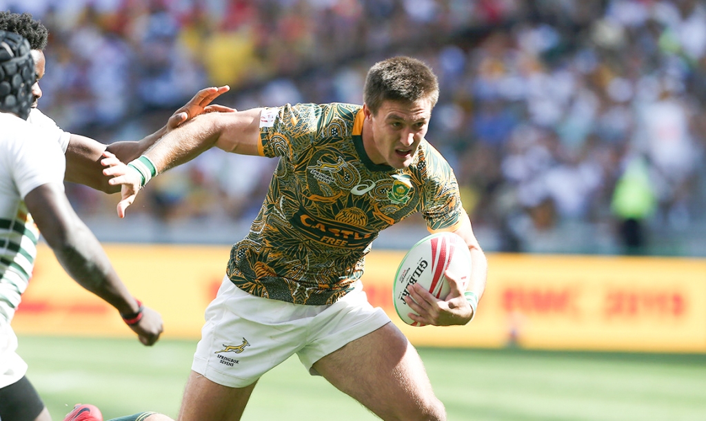
The last decade has seen an explosion in one-off jerseys created to promote worthy causes or commemorate special events, but none of them has been quite as memorable, striking or beautiful as the jersey worn by South Africa 7s to mark Nelson Mandela’s 100th birthday.
Inspired by the wonderfully intricate patterns of Mandela’s famous ‘Madiba’ shirts, but replete with Springboks and proteas, the shirt is a wonderful tribute to the special relationship between the the late South African president and its rugby team.
Wales RWC2015

Messing with the traditional colour palette is more often than not an extremely bad idea for a test nation, but in 2015 Under Armour did something quite unusual – they changed up Wales’ classic recipe, and it worked!
The addition of oxblood and gold to the classic red and white recipe could have been a disaster, but instead the subtle use of those contrast colours created a jersey that was as memorable as it was original, without feeling like it wasn’t a Wales shirt.
New South Wales 2018

Canterbury saved the Blues from a really rough few years of faux-modern designs under classic and instantly reminded everyone what a NSW jersey is SUPPOSED to look like.
With the really cool dark blue double-chevron that’s echoed on the sleeve cuffs, it’s without doubt the nicest shirt the Blues have had in years.
Stade Francais 2011/12 Home
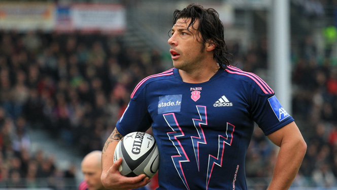
There were many times over the last decade when you could say that Stade Francais just went too far in their quest for unique, memorable jerseys, but their 2011 home shirt hit that beautiful sweet spot between classy and eccentric.
The blue and pink are a great combo, and the outlined lightning bolts are just the right side of bonkers to work really well. A proper classic.
Toulouse 2011/12 Home

It’s become the norm to see makers iterate and twist up classic jersey tropes over the course of the decade, but back in 2011, what Nike did with Toulouse’s primary jersey.
Flipping those hoops on the slant, accenting them with a pinky shade of red – it was pretty revolutionary at the time, and remains one of the club’s most recognisable designs.
Union Bordeaux Begles 2018/19 Home

It’s not often you can say that a design truly isn’t like anything else we’ve seen this decade, but UBB’s checkerboard design from last season owns that wonderful distinction.
With the checked pattern created by blue faded squares that on closer inspection feature the club’s traditional chevron pattern, there’s loads to love about this and indeed all the Bordeaux Begles jerseys from 2018.
Japan RWC2015

The jersey that was so popular it was sold out within hours of Japan’s historic victory over South Africa in the RWC2015, and while that might have been mainly because of one of the biggest upsets in rugby history, it didn’t hurt that the jersey itself was a stunner.
A wonderfully simple and classy twist on the classic red and white hoops of japan, the arc of those hoops were designed to replicate the bottom of the sun and sky of the Japanese flag.
Racing 92 2017 Home

Racing always have the head-start of one of the most undeniably beautiful home jerseys in all of rugby, but plenty of brands have mucked that up over the years, but Le Coq Sportif’s first effort with it hit so many right notes.
The classic hoops, complete with hooped sleeves, look fabulous of course, but the tricolore collar is what really makes this design soar.
British & Irish Lions 2013

Adidas’s final Lions shirt is undoubtedly the best the German brand produced since its iconic 97 version, and it’s an exercise in classy, restrained simplicity.
With a low-profile classic collar, open necked placket and simple three stripes on the shoulders, it was everything you wanted a Lions shirt to be and nothing more.
Scotland 2013 Home

What do you think your team’s jersey should look like? Ask most fans and they’ll no doubt go for the most classic and simple design imaginable… and that’s exactly what happened when Macron got fan Stuart Gray from Edinburgh to design their inaugural Scotland jersey.
Thing is, Stuart did a bloody good job, didn’t he? The plain blue shirt, the classic white collar, the nice little touches including the saltire stitching on the collar… it’s the nicest shirt that Macron have made for the SRU… maybe they should give Stu another call?
Harlequins 2016 Home

Harlequins home jersey is iconic, it’s distinctive… but for many fans the multi-coloured quarters are not exactly the most aesthetically pleasing combination. But what happened if we just turned it down a bit?
That’s what Quins effectively did for their 150th anniversary season jersey, muting the red, blue and green shades to give a more vintage look, that also felt a lot more coherent. Combined with a proper collar and we have a truly wonderful design.
Jaguares 2016 Away

Is it possible for a jersey to make you a fan of a team before they’ve even played a game? Because that’s exactly what happened when the Jaguares revealed their inagural jerseys in 2016 and the rugby world fell in love.
The black home shirt with orange trim probably deserves a place on this list itself, but for us the away shirt, with it’s vertical orange tonal stripes and black trim, is just pornographically beautiful and lovely. As unique and memorable as the Jaguares were on the field.
Cardiff Blues 2013 Home

Sometimes an idea is so brilliant that you’re not sure why they didn’t do it sooner. Given that Cardiff RFC traditionally wore black and blue hoops, and the blues had a dark and light blue colour scheme, why it took nearly a decade for someone to decide that hoops might work for the region too is beyond us.
The results, however, remain one of the benchmark designs of the decade – a wonderful use of colour and classic patterns to create one of the most downright lovely jerseys ever.
Germany 2018 Home

If you’d have told us back in 2010 that Germany would have one of the best rugby shirts of the decade, we’d probably have told you that we didn’t even realise that Germany played rugby. But nothing raises a team’s visibility like a beautiful and unique rugby shirt, and that’s exactly what Macron designed for them in 2018.
Black with white pinstripes across the front is nice enough, but it’s the middle section that really makes this special. The black, red and gold thick stripes are nice enough, but the chevron effect in the middle is just a perfect cherry on top. Entirely appropriately, it’s like someone took an 80s German football jersey and made it into a rugby shirt – more of this in the 2020s please.
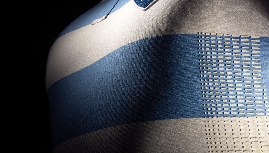
Argentina 50th Anniversary

Don’t tell us the perfect rugby jersey doesn’t exist, because we remember the 8 August 2015, when Argentina walked onto the pitch in Durban to take on the Springboks wearing a one-off jersey designed to commemorate 50 years of the Pumas.
From the gloriously retro badge to the faded blue and white stripes, the buttoned up fold-over collar and even the old-fashioned numbers… it’s just an absolutely stunning piece of design and perfectly encapsulates the best of the decade’s retro-future design ethos.
It’s such a great design that Nike pretty much replicated the design entirely for the Pumas RWC2019 jersey, but there’s nothing like the original – in every way the best jersey of the decade.


Totally agree with #1 in this Ranking.. absolutely stunning..and even more important that match for being the first time to beat Boks at home..
Yep…no1 for sure. Just a shame it was never on sale long enough to be able to buy!
Bit suprised with the ospreys choice…its certainly a nice kit but the 2 home kits before that (the pink and then the green trim respectively) really were something special. As was the 2014 euro kit for that matter.
I do think that Blues kit should get 2nd spot though. Was out of this world with its class, elegance and simplisity. And as for the Wales kit…would it he wrong for me to say to put the away version of that shirt above the home one???!
Great Selection only 2 I would add would be the 2010 England Centenary kit which was essentially the precursor to the Argentina kit and the 2019 Springboks Away Jersey.
Wasps 2017/18 Anniversary kit had my vote
You have a shirt that was never worn ?????
Let me guess ? 🤔 A Canterbury shirt at all ? 🤔
A shirt that was worn, unless you think England Women don’t count…?
G
A few that deserved inclusion, IMO:
New Zealand 2015 World Cup jersey
Brisbane Broncos 2015 Heritage Jersey (worn in preliminary final against the Roosters)
New Zealand Warriors 2015 jersey
Melbourne Storm 2016 jersey
Not as nice as the one you included, but Argentina 2015 was fantastic.
I think my favourite from the decade was either 2018 Bordeaux, or Argentina one that was in your list.
I either have insane bias, or 2015 was the pinnacle of rugby jerseys.
Great pic of the women in action in that Jersey!!!! 😝