
It’s hard to believe that when Nike took over from Adidas supplying Argentina’s shirts back in 2012, many rugby fans were bemoaning the US brand for its lack of respect for the Pumas classic look.
Since then of course, Nike have clearly got the message, as since then, they’ve gone on to create some wonderfully successful takes on the classic Pumas hoops – including one of the most beautiful rugby shirts ever created.

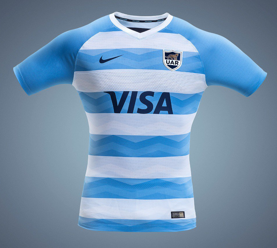
The 2018 version is another eye-catchingly modern twist on the traditional recipe. Of course we have the classic blue and white hoops, but as has often been the case in recent years, a closer look reveals more.
Running in tonal fashion across the hoops is a thin chevron pattern. We’re not 100 per cent sure if this is supposed to mean anything, but it does vaguely resemble the patterns sometimes seen on indigenous textiles, so maybe there’s something in that?

Other than that, it’s all pretty standard really – not that that’s in any way a bad thing given how gorgeous the Pumas traditional jersey is.
It’s worth noting that the sleeves have reverted to solid blue this year – after going for traditional hooped sleeves last season – and we have a new slightly v’d collar design, too. Altogether, it adds up to a pretty gorgeous recipe.

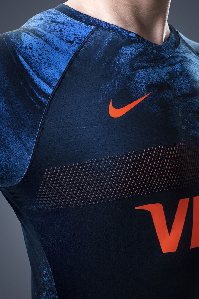
While the Pumas’ home shirts have become much more traditional in the last few years, the alternate jerseys have always been unabashedly modern and unconventional – but the 2018 vintage might be the most outside of the box yet.
The dark blue shirt features striking orange badges and grip material, but the most striking feature is the swirling, random electric blue pattern – almost like someone has half-mixed two colours on a paint palette.

The ‘theme’ of this year’s jerseys – because we all know that a jersey that doesn’t try to tell a story these days just isn’t trying hard enough – is ‘Los clubes son nuestra bandera‘, which means roughly, ‘the clubs are our flag’,
It’s designed to emphasise the idea that the Pumas embody the DNA and spirit of all of the rugby clubs in Argentina, and this ‘mixing’ the paint thing might be a nod to how the clubs combine to form the Pumas jersey.
In many ways these home and away shirts offer something for everyone. For the traditionalists, the home shirt is classic enough in its look, but there’s a nice modern twist to make sure it doesn’t feel lazily done.
The away shirt is something different altogether – it’s one of the most unconventional test jerseys we’ve seen in some time. And while it’s understandably going to not be everyone’s cup of tea, we think it’s a truly memorable design.


where can the Argentina away rugby jersey be bought