
Harlequins have enjoyed an interesting and memorable relationship with Adidas since the German firm signed up the London club back in 2014 – sometimes the pairing has produced some absolute stunners, and sometimes, well… it has not.
Now that Quins have taken the covers off their 2018/19 jerseys, then, the question is – are the new jerseys a hit or a miss?

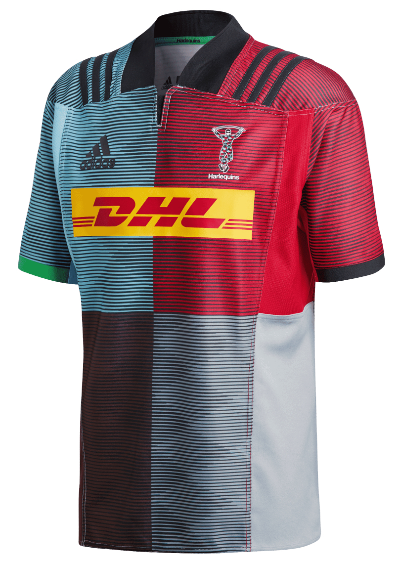
Well, as far as the home shirt goes, the first good thing about it is that we don’t have ugly uneven quarters with matching shorts this season, with them sensibly reverting to black shorts.
Instead we have what looks like a classic quartered Quins shirt – at least from a distance. The pinstriped effect given to the body and sleeves of the shirt has a secret that only really appears when you take a closer look.
The theme of this home shirt is, apparently, to celebrate the ‘Swagger of the Harlequin’ (nope, no idea) and this is reflected in the diamond pattern that can be seen in the pinstripes that cover the jersey.
It’s subtle and easily missed, but it’s a nice way to nod to the pattern that covers the jester who has been the Harlequins club crest for over a century.

If the home shirt is a nice modern twist on the Quins classic recipe then the away shirt is, well… it’s a twist on something, we’re just not really sure what.
Adidas has dubbed the away jersey ‘menace’ and apparently ‘speaks to the menacing yet playful character that is the Harlequins jester’ – er, sure thing.

What this means in practice is that we have a diagonally quartered jersey of black and lime green, with a rough and weathered diamond pattern similar to the home jersey covering the front of the jersey.
We know that clashing and contrasting colours is kind of the schtick when it comes to Harlequins jerseys, and we’re happy for them to revel in that most of the time, but honestly – lime green and black should not be paired with pale blue under any circumstances.

It all comes together to create what can only really be described as a damn ugly jersey – we’re big fans of bold, modern designs here at RSW, but sometimes too many ideas can get thrown at something and we think that’s what’s happened here.
It’s a shame, as it rather overshadows what is another very cool, very clever home shirt design, that we’re sure fans will be relieved will be worn most of the time this season.


Now don’t get me wrong but pretty sure that’s the same green used in the away shirt as in the home shirt? In which case the blue and green are always paired together? Maybe just too much of it.
Yeah, it’s the abundance of green here that’s ruined it we think – plus think green on blue looks worse than blue on green for some reason