
It’s been just over a year since we saw what Le Coq Sportif would do with a modern France jersey, having taken over from Adidas in July 2018… and while some people liked their mix of classic and vintage, we broadly absolutely hated it.
For the Rugby World Cup 2019 jersey, however, things have changed in plenty of ways, but are they for the better?
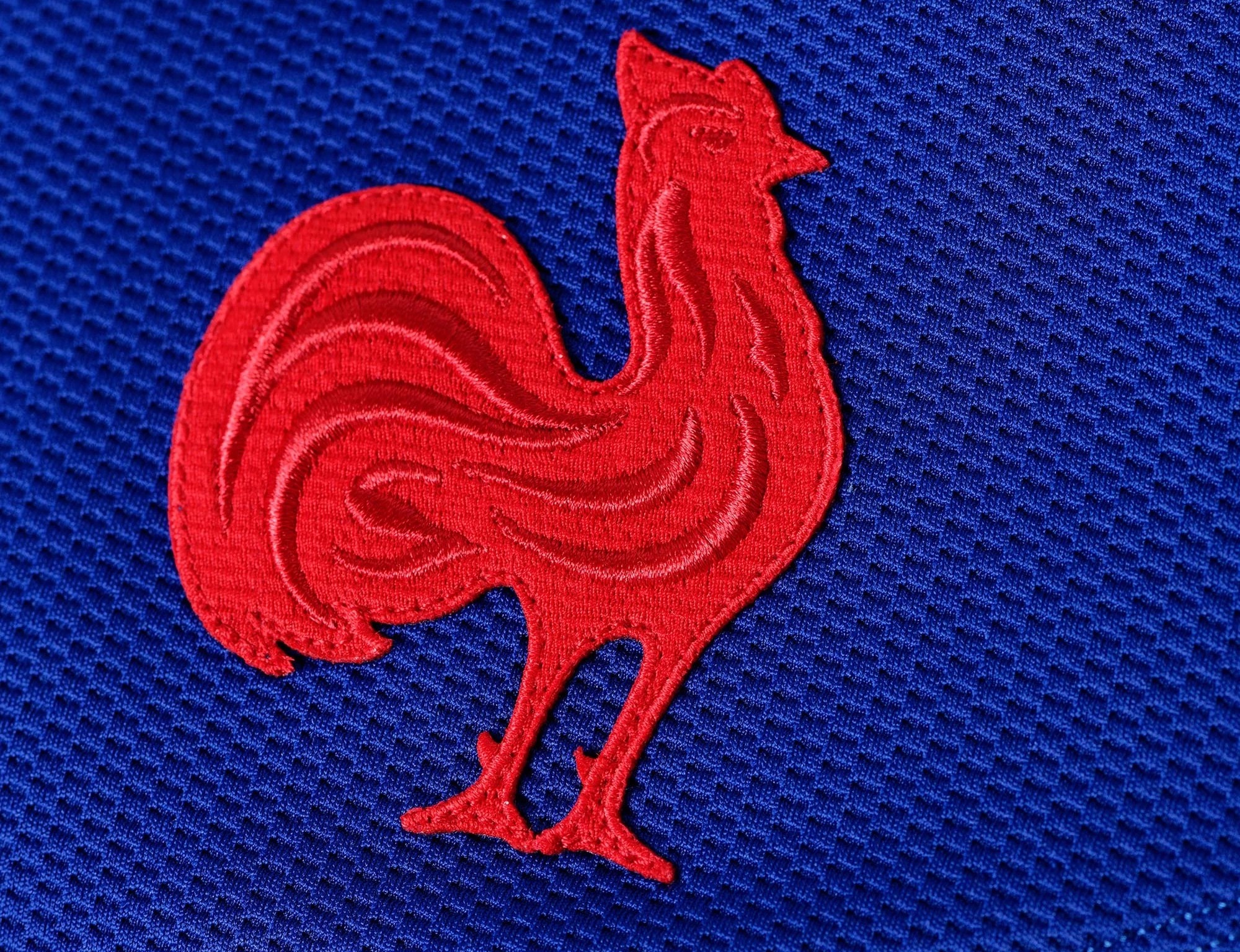
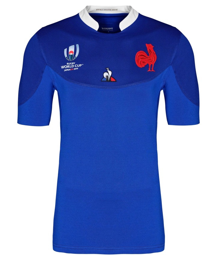
First up, we need to talk about the elephant in the room – or should that be the chicken? Yes, the most striking thing about this new France shirt is the brand new ultra-minimalist FFR crest. It’s apparently a nod to the cockerel worn on the earliest French jerseys, and it’s certainly very striking – we like it.
Other than that, it’s really rather simple and clean on the design front – there’s an interesting contrast between the top and bottom of the shirts thanks to a slightly darker and different style of fabric being used, but otherwise it’s totally clean – perhaps a little too clean?

We do like that, however, and we’re glad to see the back of the hideous ‘necktie’ collar design. While the stub collar is fine here, and very clean and understated, just imagine how good this shirt would have looked with an old-school collar?
Inside the collar, we also get the legend ‘Our shirt, our history, our country’ which is suitably patriotic we’re sure you’d agree.
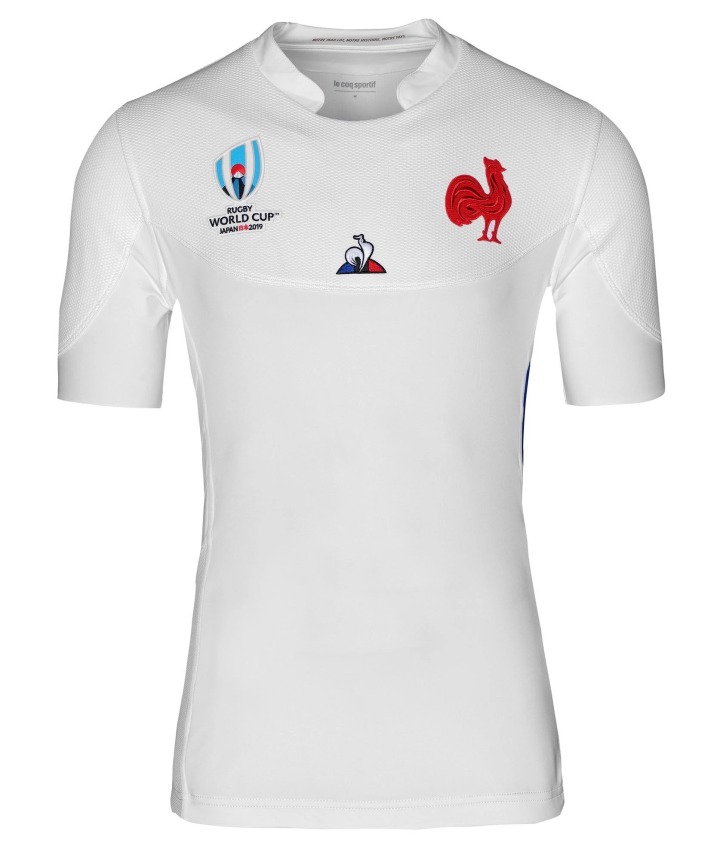
It’s often the case that the France alternate jersey is even nicer than the home, and true to form the change shirt here, with its box-fresh whiteness (with blue side vents) it just looks unbelievably cool, and makes the new logo pop really pleasingly.
After the car crash of the first LCS French shirt, this is a welcome exercise in restraint and class – it might be a bit plain for some, and it’s on the verge of plain t-shirt territory, but we think they are ultimately a great pair of jerseys.


These are definitely better than the first attempts by Le Coq but I’m still just not feeling them, especially the home. I agree that a classic collar would look better, but so would a single shade of blue. The curves from the separation of the shades of blues are really, really off-putting. It would have been better with just a single shade or at least a better design. I understand that it follows the stitching pattern, but that looks like hell. Maybe next time they’ll finally get it just right.
The use of the word “alternate” in your headline is incorrect. The correct word is “alternative”.
The universally accepted term for a test-level change shirt (as the tern ‘away’ does not accurately reflect their usage) is ‘alternate’.
we broadly hated it > It’s a perfectly acceptable design, but ..
😀
+ they’re not great 🙂
White ones won’t ever be great until they’re matched with blue shorts and red socks.
Blue isn’t the right one, samurai marketting stuff a pitty.