
Sale Sharks are a team on the up – after a season or two of off-field turmoil and on-field struggles, the Manchester club have really turned things around in the last two seasons, qualifying for the Champions Cup in 2013, and managing a respectable seventh last term. Sale fans will be hoping to kick on again in 2015/16, and they’ll be doing it wearing their first new kit in two seasons, supplied once again by Norfolk-based firm Samurai.
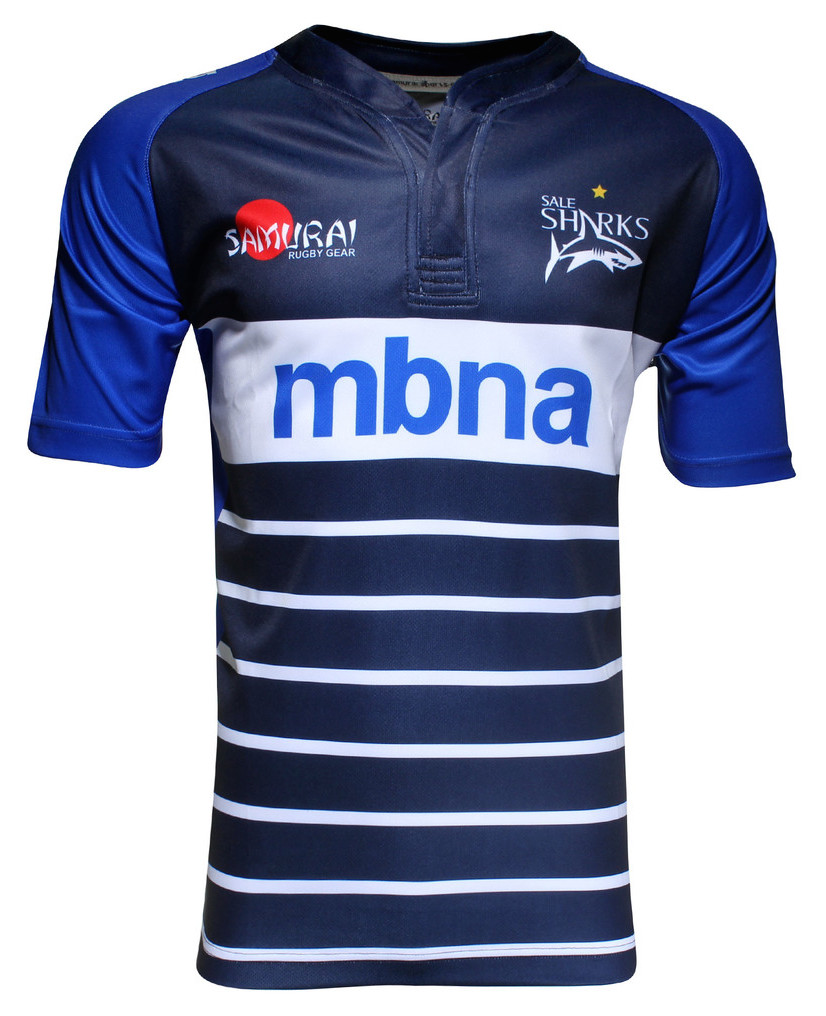
2015 is actually a rather significant anniversary for Sale, as it marks 10 years since the club won their first and only Premiership title, and in a nice touch, the new shirt shirks the none-more-shark look of the last two years to go for something that’s a darn sight cleaner, classier, and tips a fairly big nod to that victorious season of a decade ago.

The Cotton Traders shirts worn by the Sharks back when sale earned the solitary star that sits above the club badge were also some of the club’s most memorable and distinctive designs. With the dark blue body with its vertical lighter blue sides and sleeves, it was quite the departure from the single-colour blue designs the club had worn since adopting the ‘Sharks’ monicker in 2001, and this shirt is a clear homage to that.
While the design of Samurai’s ‘Iconix’ shirt template prevents it having the same vertical look to the ’05 design, with its contrast between the light blue on the sleeves and shoulders and the dark blue of the body, it’s clear what the intent is here. That said, the sleeves’ shade of blue is definitely a lot lighter than the 2005 version, but we think it works.

The body of the jersey is equally hinting at Sale’s heritage, but in a distinctly modern way – echoing the classic blue and white hoops of Sale FC, but in oh so bloody fashionable right now narrow stripes. Even though the look is very much the big trend in shirt design this season, we really love the way it’s been implemented here.
Some people have grumbled about the large white band across the body that contains the main sponsor, as fans always do about the unavoidable reality of prominent shirt sponsorship in modern rugby, but we think it’s been handled in a way that’s both striking and tasteful. While last year’s shirt was very popular with Sale fans, we think this one’s a cut above – it feels modern, unique and classy, while also paying great tribute to the club’s greatest achievement.

If the home shirt is all classy and tasteful, the away shirt is well… bloody hell would you just look at it! We’ve often said that change shirts are the ideal venue for clubs to try something a bit out there, and you certainly can’t accuse Samurai and Sale of shirking that responsibility here.
We’ve seen smattering of fluorescent colours on rugby shirts from time to time – the clever little accents on last season’s Saracens gear, for example – but this is a whole other animal. It’s loud, it’s proud, it’s suitable to be worn while running/cycling at night and whatever you do don’t wear it if you’re pale-skinned and/or ginger – it’s 100% flouro.

You can’t help but chuckle at the sheer lunacy of creating a shirt this colour – look at the photos, the damn thing looks a different colour in every one you see because it’s so bright, it’s clearly a nightmare to photograph without blowing out the image. It’s perhaps the most striking new shirt we’ve seen this year – and we’re not even sure if we mean that in a good way or not. It’s memorable, it’s unforgettable –but is that because the sheer amount of flouro here (the socks and shorts are all the same colour) kind of batters you into submission?
Staring at this shirt for an extended period of time to do this review has actually given us a weird ache in our temples, which is probably an advantage if you’re wearing it and the opposition has to stare at you all game, but might be less enjoyable if you’re watching it. And don’t even get us started on the inevitable moment this season when in the heat of the moment, Danny Cipriani throws one of those beautiful miss-two passes to a steward who was standing just a bit too close to the touchline…

In truth, we like the design on the whole, though we think a little more black would have made the shirt feel a bit less OTT, and we don’t think the grey accents really do anything for it either. As a bold, memorable statement jersey however, there’s no doubt that it does the job!
Two shirts then, and two very different approaches to creating an eye catching shirt. We love the elegance and thinking behind the home shirt a bit more than the ‘shove a day-glo bottle in your face’ brashness of the away, but rugby shirts are a broad church, and there’s plenty of room for everyone!
SHIT/GOOD RATING: Good

