

The 2014/15 season has been a mixed bag for the Scarlets, but one with a certain degree of familiarity to it. After reaching the playoffs last season, the expectation that the Llanelli region would be the standard-bearers for Welsh hopes in the Pro12 seem to be rapidly receding – at time of writing they sit outside the playoffs places, while the Ospreys are sitting pretty in second place. In Europe however, as seems to be the way with the Scarlets, they’re second in a very tough pool, with a realistic (though still tough) shot at being the only Welsh team to reach the knockout round of the Champions Cup. Domestic meh with impressive European fight has been the way out West for years, and so it makes sense that their schizophrenic performances are joined by two very different shirts…
After a few years with Burrda, the Scarlets returned to wearing Kooga-made kit this season, and with it has come a simplification of the home shirt design to something more classic. Last year’s effort had all sorts of peculiar lines and quite a fair bit of white, but this keeps things core – Scarlets is what it says on their home ground, and scarlets they are on the pitch.
It’s not totally plain however – there’s some flashes of white and a darker red going up the ribs on each side of the shirt – given the way it hooks round the rear of the jersey, we think they’re supposed to represent the wings of the dragon on the Scarlets badge, and we think it looks quite nice, breaking up the red a little without being too detrimental to the clean, classic vibe.

It’s not a totally plain red shirt asides from that, either – if you look closely around the shoulders and chest of the design, you’ll notice some subtle sublimated detail that gradually fades as you move down the chest. We think these are supposed to represent dragon scales, and between the current Wales shirt, and this year’s London Welsh shirts, that motif has become pretty popular. We’re not in love with the idea, but it’s done subtly enough here that we don’t think it detracts from the shirt’s overall look.
Speaking of subtle, let’s take a look at the away shirt, which, as we’re sure you’ll agree, is the very opposite of that…
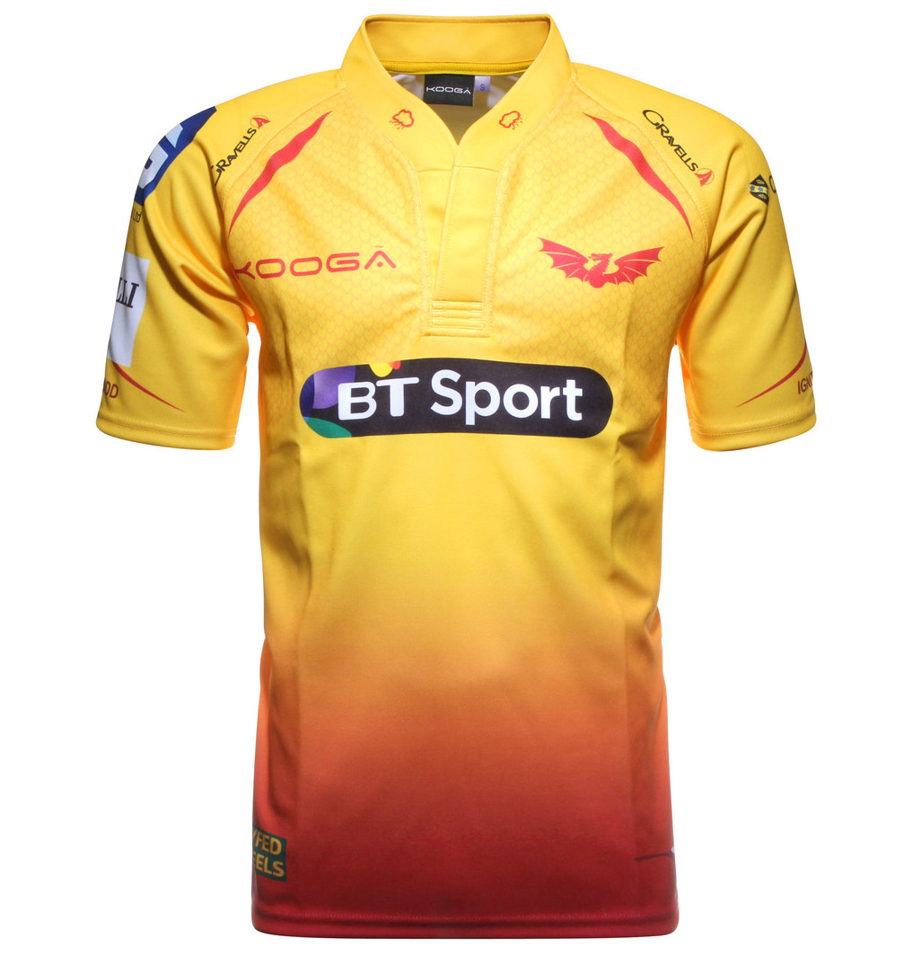
Wow. Yes, well, we said these were two very different shirts… but we’re not sure if this one reflects the Scarlets exciting brand of attacking rugby, or their tendency to do something stupid and match-losing at the most inconvenient of times…
Owing more than a little creative debt to England’s infamous ‘tequila sunrise’ Sevens shirt from a few years ago, this is certainly quite a departure for the Scarlets. Traditionally they’ve left the eye-catching shirt designs to their rivals the Ospreys, opting for alternate shirts of black, dark blue or brown hues. This… well, this is not that.
Pleasingly for an alternate shirt, it’s not a simple palette-swap with the home shirt, at least. While the dragon scale motif is present and more visible here, there’s a few extra flecks of red that aren’t present on the home shirt in the chest, back and shoulder areas, while the side wings have gone altogether.

You could argue that there’s a good reason to dump the wings, and that’s because the jersey’s colour (or should that be colours) is all the ornamentation you need. Yes, we really need to talk about that red-to-yellow fade – does it work? Does it look like something more at home on Miami Beach in 1984 than on a rugby pitch in 2014?
Well… maybe… but there’s something about the madness of it that we can’t help but quite enjoy. Plus, combined with red shorts, it actually looks alright. The main problem we have with it, to be quite honest, is that the damn thing is yellow, and yellow is a dreadful colour for a rugby shirt (sorry Clermont) – but that’s just our opinion, man…
So, two shirts that are really rather different – a rather nice, classic, simple home shirt, and a polarising, weird alternate shirt that in spite of ourselves we can’t help but like. So wrong it’s right? Quite possibly.
SHIT/GOOD RATING: GOOD? WE DON’T EVEN KNOW ANY MORE


