
For the last few years, USA Rugby has been having their kits made by Canterbury, and despite the USA’s relatively minor place in the pantheon of great rugby powers, it always felt as though the UK firm was really making an effort to supply the Eagles with something a bit out of the ordinary and interesting. But this year, the USA has joined a host of other clubs and national sides in signing up with Aussie big noises BLK – are they going to keep things as interesting as Canterbury did? Let’s dive in…
Well, on first examination, you’re probably a little underwhelmed. BLK, like many brands, have a template that most of their designs in a given season will follow – this could easily be dismissed as a simple palette swap that’s very similar to the BLK Melbourne Rebels shirt this season.
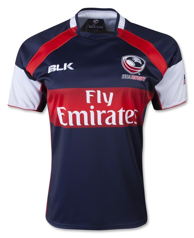
But we think this is a little unfair. Yes it’s not exactly the most elaborate kit design ever – but when did kit designs have to be busy and elaborate? We really like the clean design the BLK has used here, and it’s not like this is a plain shirt with a badge on it.

We really like the band of red across the middle for the main sponsor – if you look closely you can see a subtle striped texture, no doubt a subtle nod to the stripes of the US flag, which is very much not subtly located on the jersey’s sleeve. Speaking of the sleeves, the large white panels here look nice, too, giving an extra bit of white to complement the blue and red, but in a tasteful way. It’s also worth noting that the USA have changed their primary home colour to dark blue from last season’s white.

The alternate shirt is basically a palette-swap of the home shirt, with some switching around of colours here and there to make red much more of the third colour used. We really like the way the belly band has been accented with red stripes here – we wish they’d done the same with white on the home shirt, and we think the consistent use of red purely as a piping/accent colour on the trim and chest panels really works well, too. The blue sleeve cuffs feel like an extension of the middle stripe here, which works better than the contrast between red and white on the home shirt, in our opinion.
One thing we’re not so keen on is the grey stripe up the sides of the shirt – it’s a bit unnecessary, and when you’re already using three colours, an extra one feels like over-egging things somewhat.

People have come to expect something a bit out of the ordinary with USA shirts in recent years, but really most of the truly bonkers stuff has been left to the Sevens shirts, which we’ll be looking at soon. While these might not be the most boundary-pushing shirts, they’re nice, clean, interesting designs that look great. What more do you want, eh?
SHIT/GOOD RATING: GOOD


