

With the Six Nations nearly upon us, France have sneaked their new alternate shirt under the bar just in time for it to be worn against Scotland for the first match of this year’s tournament. The home design this year was a definite break with tradition, and so is this, but in a different way, so let’s get stuck in and see what Adidas have come up with.
The most striking aspect of this shirt is of course the colour – France alternate shirts have traditionally always been white, with blue as the secondary colour. That’s what we saw with last year’s shirt, and pretty much every other France alternate shirt ever.
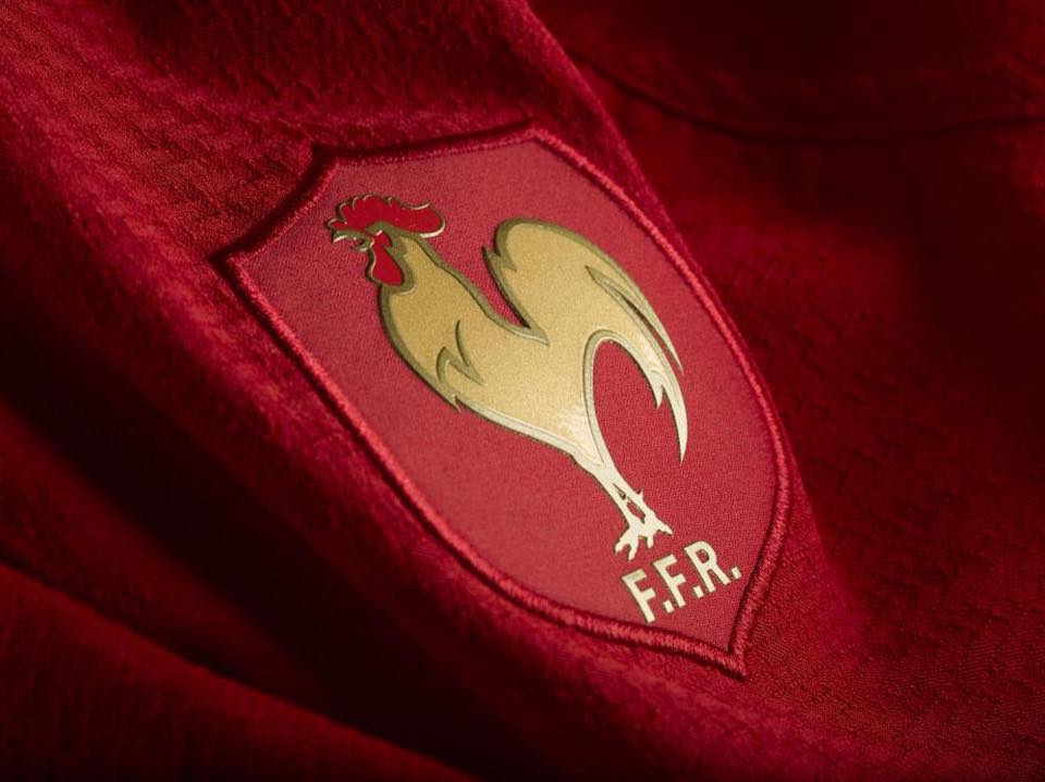
This on the other hand is very much NOT white. Or blue for that matter. We noted when we reviewed this year’s home shirt that there was a lot more red being used in the design than in previous years – it’s generally been the shade of the Tricolore that designers have neglected in designs previously… well not any more.
While there can be little doubt that this look is a big break from tradition (as one of the RSW team noted, perhaps the colour change is a result of the FFR suddenly being taken over by a Malaysian businessman… ahem…) you can’t deny that this is an incredibly handsome shirt. What’s more, the red shirts aren’t without precedent as France have worn a red change shirt before, but only twice – in 1958 and 1958 against Scotland and Australia.
Rather than a straight palette-swap from the home shirt, the design here seems to bear more resemblance to the Italy alternate shirt we reviewed earlier this week, though it’s even cleaner and more subtle than that lovely design. The use of dark red, with an even deeper red for the stripes and collar, contrasted by the striking gold of the Adidas logo and the er, cock, just works so well. Traditional it might not be, but this is an exercise in classic, clean shirt design.
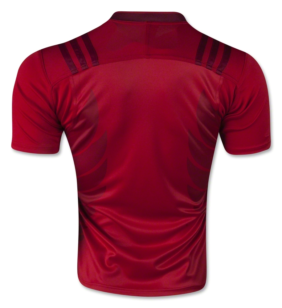
Around the back however, things get… well they get a little weird. On first glance it’s a reflection of the clean, classy look that’s going on at the front. But look at the ribcage – yup, those would very much appear to be wings.
We’re not entirely sure what those wings are there to represent though. Are they supposed to be the wings of the aforementioned golden cock that is the crest of the FFR? If so, that’s fine and everything, but we’re not entirely sure why you’d want to remind everyone of a noisy farmyard animal bursting into undignified flight – it’s hardly a dynamic and inspirational image, is it?

And then there’s the look of the things – they’re fine and everything, they don’t ruin the shirt, but there’s definitely an ill-advised footballer’s back tattoo vibe about them there wings. And that’s not good – that’s not good at all.
So, another France shirt, and another attempt to break with tradition by Adidas and the FFR. But the alternate shirt, while a unconventional, is definitely a more palatable change than the radical colour and vibe departures of the home shirt. Red might be a new one for France’s change shirt, but when it’s executed in such a classy way, we find it hard to complain (weird back wings aside).
‘Red outside, blue inside’ is the tagline Adidas are marketing this shirt under – if the results keep on being this impressive, they can keep the red outside for as long as they like.


I actually like this design, especially compared to the new home shirt.
I want to buy this shirt. Do you know where I can purchase it?