
It’s been a few torrid months for Bayonne fans, players and anyone associated with the club recently really, relegation from the Top 14 on the final day of the season, the messy on again, off again talk of a Basque-fusion with rivals Biarritz, and many front-line players leaving, Joe Rocokoco and Scott Spedding to name but two.
With talk of that merger not going away, and a low-key season where Bayonne will look to make a speedy return to the top flight, it makes sense that Kappa has opted to keep things simple and let Bayonne’s undoubtedly lovely colour scheme speak for itself this season – after all this might be one of the last times its used!
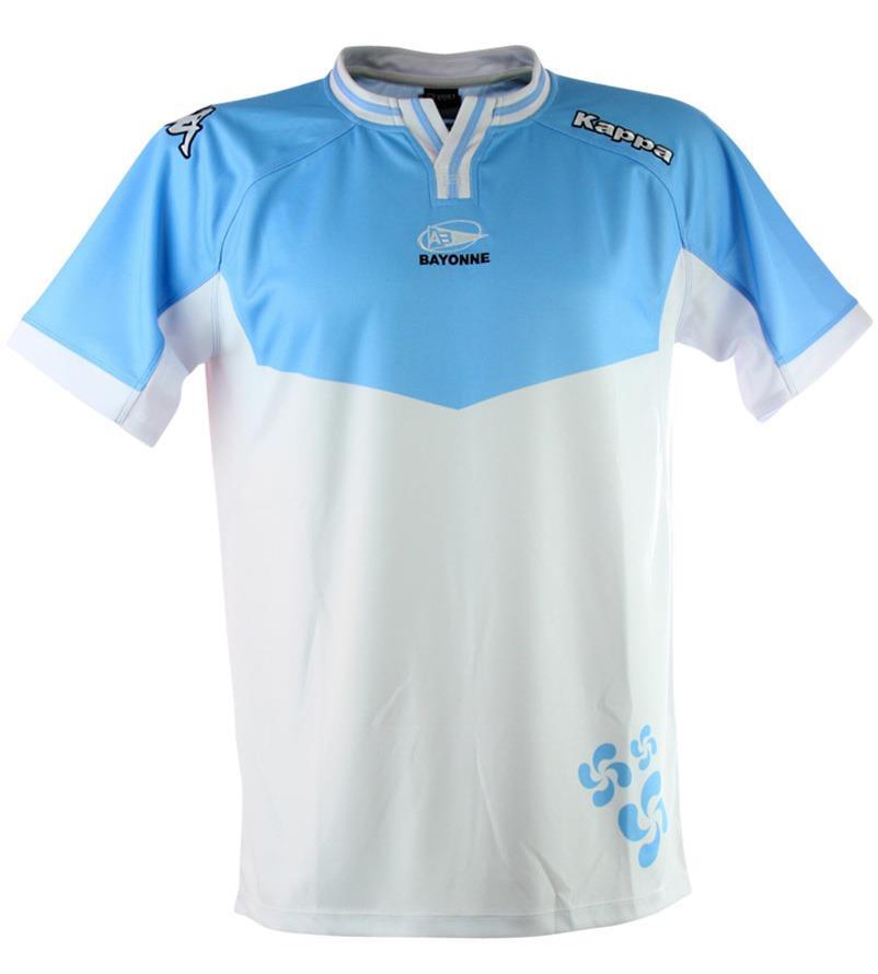
Like the other ‘Kombat’ jerseys from Kappa this year, the most prominent design feature is a low granddad collar with a very retro striped effect. As has become the standard for recent Kappa Bayonne home jerseys, the design is split half light blue and half white, though there’s a distinct lack of dark blue this time around, which we always quite liked for contrast previously.
The V-shaped panel on the chest it’s something of a hybrid between the gorgeous curvy number of two seasons ago, and the more utilitarian straight bands of last year, and while we prefer it to the 2014 vintage, it still lacks the elegance of the 2013. On the bottom left of the shirt the first link to Bayonne’s Basque heritage is seen with a Lauburu or Basque cross, which has become something of a staple on Bayonne shirts recently, too. Honestly, though, while we like the nod to heritage, we still think it’s location and prominence looks a bit weird.

On the back of the home shirt is the second Basque mention, with the Ikurrina (Basque flag) on the back of the neck. We’ve not seen this flag appear on a Bayonne shirt in recent years, and indeed, the green, red and white standard has been more associated with Biarritz – it’s inclusion here is sure to fuel talk that they’re laying the groundwork for a merger, but either way, it’s a nice, subtle little touch.

The away jersey for this year will be an exact replica of the home shirt, just with navy replacing the white. It might not be as interesting as the combination of black, chocolate brown and blue from last season’s away, nor as hideous as the red and green third kit, but sometimes that’s fine.
Those colour combinations might have historical significance to the citizens of Bayonne and of the Basque region in general but light blue, navy and white are bloody nice colours when combined. No need to complicate things.

Round the back of both jerseys, the numbers are contained with in an outlined box, though it stands out more on the away shirt. Numbers in boxes should be mandatory in rugby if you ask us, and seeing a return to this wonderfully retro jersey feature is never a bad thing at all.
Bayonne’s home jerseys have been subtle variations on a nice, pretty individual idea for the last few years, and these are no exception. While it might not hit the high water mark of the 2013/14 vintage, and we’d like to see some more dark blue in the home shirt, these are two very nice shirt, with some clever retro-vibed touches, and a pretty unimpeachable colour scheme. Nice.
SHIT/GOOD RATING: Good


