

An new All Blacks shirt reveal always follows the same pattern. There’s always a great deal of hype, speculation and excitement in the lead up to the reveal, followed by a torrent of incredulity and moaning that the design hasn’t been radically overhauled. “It’s just a plain black shirt!” “It’s exactly the same!” “Boring!” – these are all comments we’ve seen a lot of since the reveal of the new All Blacks Rugby World Cup shirt today… and yes, fundamentally, this design isn’t exactly breaking the mould, but we think people complaining are missing the point…
Yes it is, at its most basic level a plain black shirt, but what else did you expect? That said, upon closer inspection, you have to say that this shirt is not ‘there are quite a few similarities to the regular shirt that was unveiled to much fanfare back in November last year. For starters the striking ‘carbon fibre’ effect used on the ‘blackest jersey ever’ has been retained for the players issue shirts (though not for the supporters’ version pictured here, oddly)…

That’s not the only aspect of the None More All Blacks shirt to have been retained, either – namely the ‘Gunmetal Silver’ fern and Adidas logo, which we are still very taken with. It looks sleek and we like the way it catches the light on the field. One thing we’re not keen on, however, is the way that, in a similar vein to Australia and South Africa, the Rugby World cup logo has been printed straight onto the shirt’s right breast. We prefer the ‘patch’-style that the likes of Macron and BLK have used for their RWC designs.
We also take issue with the notion that this shirt is boring. There’s a story to this jersey, and one that shows the level of thought that has gone into the the All Blacks Rugby World Cup shirt is far from cursory…

While the hatched ‘Woven Carbon’ effect of the non-RWC shirt has gone from this design, there is a significant pattern woven into the shirt – a subtle collection pinstripes that create a chevron effect around the shoulders and upper chest area. On first look you might dismiss this as just a bit of design license, but there’s a lot more to it than that.
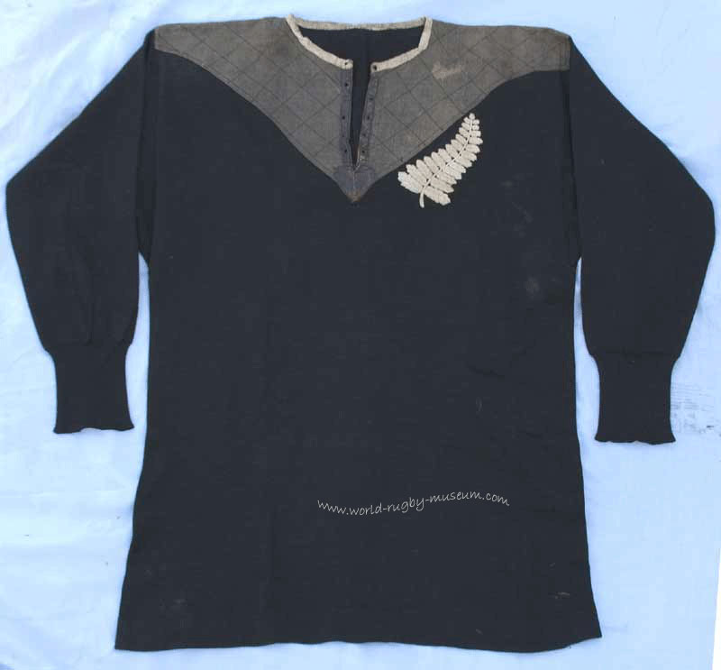
In 1905, New Zealand toured the British Isles. It was not only the first time that New Zealand had toured outside of Australasia, it was a pivotal moment in the history of New Zealand rugby. The team played 35 matches and five tests, losing just once, and crucially, it was also the first time the term ‘All Blacks’ was used to describe NZ’s national team. The ‘Originals’ as they’re now known, went down in rugby legend both at home and abroad, and the jerseys worn during that tour have become iconic and treasured – just last year a 1905 tour jersey was sold for over £20,000 at auction.

Ironically however, given that they inspired the use of the term ‘All Blacks’, the Originals wore shirts that weren’t actually all black at all. Instead, they were black with a large grey chevron around the shoulders. While Adidas and the NZRU might have balked at going quite that far here, the chevron effect is a subtle but very classy way to nod to that legendary first All Blacks side.
It’s also very fitting to mark the Originals’ contribution to the All Black legend at this World Cup – it’s been 110 years since that 1905 tour, and the tour was of course to the British Isles, bits of which will be hosting the tournament, of course.

In spite of all that, cynics might say that, ultimately, this is just another plain black shirt. But, we say again, what did we expect? That black shirt has a prestige and significance that transcends rugby. The All Blacks shirt is not just THE most iconic uniform in rugby union, it’s one of the most recognisable sports brand in the world, in any sport.
Adidas have been moving away from big money sport sponsorships in the last year or so, ostensibly to counterbalance the massive amount of cash they’re paying Manchester United now. The cutting has been pretty vicious – they’ve not renewed deals with the British & Irish Lions, Andy Murray, England Cricket, they lost the NBA rights to Nike… it feels like they’re cutting away anything they can… and yet they’ve kept the All Blacks. The German sportswear giant understands the significance of being associated with such a legendary brand, and when you have an equally legendary uniform, you don’t mess around too much with it.
Rugby shirt aficionados might want the All Blacks to try something a bit different, but the wider rugby fandom want New Zealand playing in a plain black shirt with a silver fern on the left breast, and we’re not sure what Adidas would really gain from messing with a classic for the sake of it. This is a thoughtful, classy take on the recipe, critics be damned.
SHIT/GOOD RATING: Good


As far as I can see adidas have just highjacked this idea from Canterbury of New Zealand and thare Queensland Marooons
2015 State of Origin kit and as far as I am
concerned adidas are just trying to pull the wool over everyones eyes with this new
All Blacks R.W.C kit adidas need to buck up thare ideas
I for one am not buying this
kit being a nod to the 1905
-1906 Originals.
Dave Gallaher & co how will be still playing up in Heaven wil be waveing thare fistes at adidas in
disapproval because as we all know rugby union is the game they play in heaven.
Canterbury did something a little similar with both the Maroons and the Kangaroos in Rugby League, with the difference being that the embossed V is a nod to the V designs that are synonymous with Rugby League jerseys in general.
Adidas may well have got the idea from them, but this is a nod to something different, and I think it works very well.
Hi there,
I have seen two versions of the jersey, one with carbon weave pattern, and one with not? I put the contrast down and brightness up on this image and you can clearly see the pattern
Yeah you’re right, the carbon weave is still there on the player-issue shirts, just not the regular ones.
So on the shirts the actual All Blacks play in, have the carbon weave? Thought so, I love it!
Hallo where can I order All black rugby jerseys? Can you please send me the detaila I ‘n from South Africa Regards Kotie Swart