
After a few years wearing some fairly uninspiring shirts produced by UK firm Kooga, Canada have become just the second test playing nation to sign a sponsorship deal with US sportswear giant Under Armour. As you’ll no doubt already know, UA also supply Wales and Clermont Auvergne and uh… well… that’s somewhat hard to forget here… let’s take a look.
Like every kit supplier, Under Armour has a set template that it produces variations on to supply the various teams that it kits out. Look around this site and you’ll see that practically every team has a core basic design that they extrapolate from by changing the colours, patterns, collars and the like on a case-by-case basis.
Under Armour, however, really don’t do much extrapolating from that basic template, to the point where their shirts are nigh-on identical. We haven’t been in any great hurry to review the new Clermont shirt this year – why? Because it’s literally identical to last year‘s but with a bit of blue around the armpits. That’s it.
It’s a little disheartening, as a website that reviews new rugby shirts – how on earth are we supposed to review a shirt that is nigh-on identical to last year’s Wales kit?

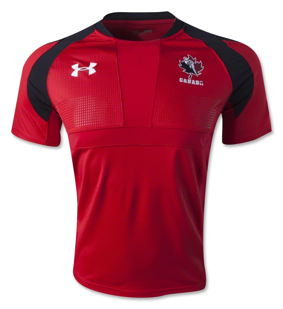
Well, we can tell you what’s different – that’s about it, really. Unlike the Wales shirt, there’s no ‘dragon scale’ grip material on the front of the jersey, with the plain dots used on the Clermont shirt brought in instead. Like this year’s Clermont shirt, there’s no multi-colour side panel here, which is a definite plus, and the panel on the armpit/shoulder area is black, where it was red on the Wales shirt, again, in a similar style to the Clermont shirt. We like it, we have to say, it adds a bit of interest to what is an extremely plain shirt.
Oh, and there’s a Canadian flag on the sleeve. Woo! Viva la difference!
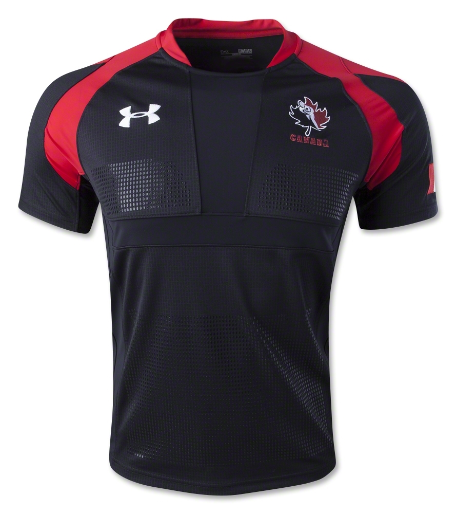
The alternate shirt is a simple palette-swap, with the black replacing the red. It’s perfectly nice, but it’s hardly going to inspire elegant prose to fly from our fingers, is it?

That said, at least this one isn’t grey as well…
We understand that Under Armour’s presence in rugby is very small, but when you’re only supplying three teams, does that not imply that you could maybe do something a bit different for each one? Even if they kept the template broadly similar, there’s surely scope within the designs for all three of UA’s teams to have a distinct visual identity. Instead, it seems like UA put a bit of time into the Wales shirt, and then let Clermont and now Canada make do with virtual copies.
Not that any of these shirts aren’t nice, of course, but we’re getting a feeling that Under Armour aren’t really putting much thought into this, and we think Canada, Clermont and Wales all deserve a little better.
SHIT/GOOD RATING: GOOD SHIRTS… SHIT EFFORT


