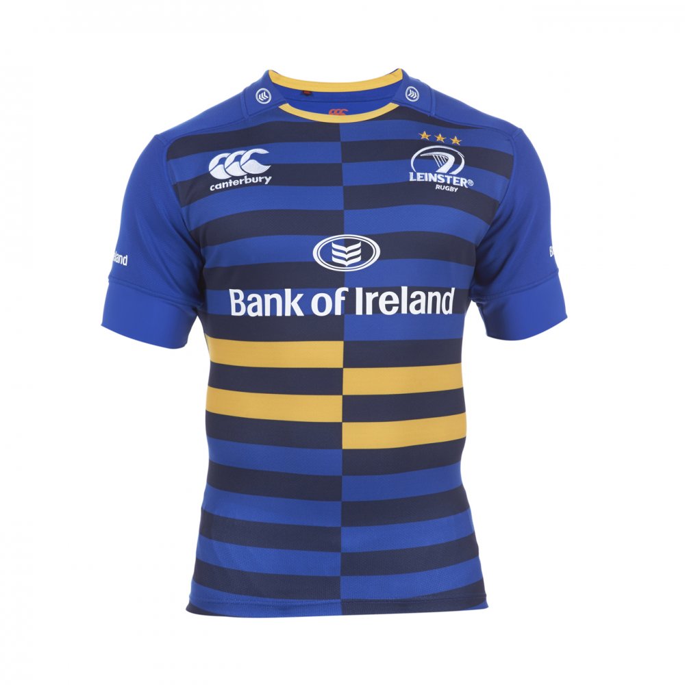
For the last year or two, Canterbury has developed a bit of a reputation for producing some of the most handsome rugby shirts in the game. By and large, that reputation has been born from the UK-based firm turning out a series of classic, simple-looking shirts that often recalled classic designs of rugby’s good ol’ days. The brand new Leinster European shirt takes all this, and turns it right on its head.
We’ve seen some pretty eye-catching designs from Canterbury over the last few years, no least the two most recent Cardiff Blues European shirts, and (substantially less successfully) the Leicester Tigers shirts of two seasons ago. However, this feels like something different – since the borderline-tacky Tigers shirts, most Canterbury designs have favoured solid colours and minimalist design, and have left the ultra-modern stuff to makers such as Adidas and BLK.
This, however, is quintessentially a modern rugby shirt. The most striking thing, of course, is the elongated checkerboard pattern on the front of the jersey, alternating between the lighter and darker shades of blue that have both featured on Leinster home shirts in recent years. As if that wasn’t enough, the front of the shirt is completed by four alternating gold bars on the lower half of the jersey.
Leinster fans have generally responded very well to the return of the traditional gold third colour to this shirt, and indeed, Canterbury tells us that the four gold bars are designed to represent the four strings of the harp in the Leinster badge.
You can decide for yourself whether that’s so much marketing tosh, or a lovely way to reflect the values and heritage of the storied province, but on the whole, we can’t help liking the whole design. It’s unflinchingly modern in a way that we haven’t seen from Canterbury of late, while avoiding the common pitfall of making things too busy that it’s tacky. That said, the OCD side of us can’t help but look at it and positively will those two unaligned sides to just snap into place to make some nice, classic hoops. But then we’re a bit weird, so…
Another part of the jersey that sees a splash of the traditional gold is the collar, which also now makes use of the new ‘Loop 21.3’ collar (nope, us neither), as opposed to the more soft-V-shaped ‘Loop 21’ design that’s been a bit of a hallmark on Canterbury jerseys in the last few years. We liked the design on the most recent England shirts, but in practice, we’ve found that it’s not the easiest thing to get your head in and out of, so if you’re possessed of a truly massive cranium, you might have some bother here…
The rear of the jersey couldn’t be more different to the front – it’s as simple and plain as could be, and carries on Canterbury’s policy this season of having a sharply contrasting back and front of the design. With the new Blues shirt, we felt that it looked a bit rubbish, to be honest, but by using a pattern as opposed to a colour to provide the contrast, we think it works much better. Continuing the checkerboard thing all the way around would have looked, frankly, shit, so keeping things simple on the back is more than welcome.
So this design is quite a departure, for Canterbury, and for Leinster too, who have worn an ultra-simple European shirt for the last couple of years. It’s very easy to cock up a bold modern shirt design, which is why we’re seeing more and more ‘new’ brands keep things ultra-simple and classic when they enter the market, to avoid the risk of getting a reputation by trying something that tanks badly…
Canterbury certainly aren’t a new brand, but over the last few months, we’ve had a vocal minority of people complain that Canterbury’s shirts are becoming boring and safe, going for inoffensive over the innovative. This is an effective response to that criticism. As with most modern, bold designs, it won’t be for everyone, but the social media response so far has been widely favourable, showing that Canterbury can produce strikingly modern shirts that don’t go over the line into tackiness when they want to.
We love the classic look of many of Canterbury’s designs, but if they keep producing shirts like this, we’re happy to let them keep pushing their boundaries.
SHIT/GOOD RATING: GOOD


