
The trans-Tasman test match has become a bit of an afterthought in the rugby league calendar in recent years. This annual mid-season match between Australia and New Zealand finds itself sandwiched awkwardly between the razzle-dazzle of the NRL and the blood and thunder passion of State Of Origin, with minimal preparation time and little publicity, and it’ rather suffered as a result.
This is no fit state for international rugby league – it should be the pinnacle of the sport, and it’s a shame that a test match between the two best international teams in the world should be a bigger deal than it is.
Hopefully the 2015 game officially receiving permission to be known as the ANZAC Test for the first time in over a decade to mark the 100th anniversary of the Gallipoli landings, will at least boost interest and enthusiasm on both sides of the Tasman sea.

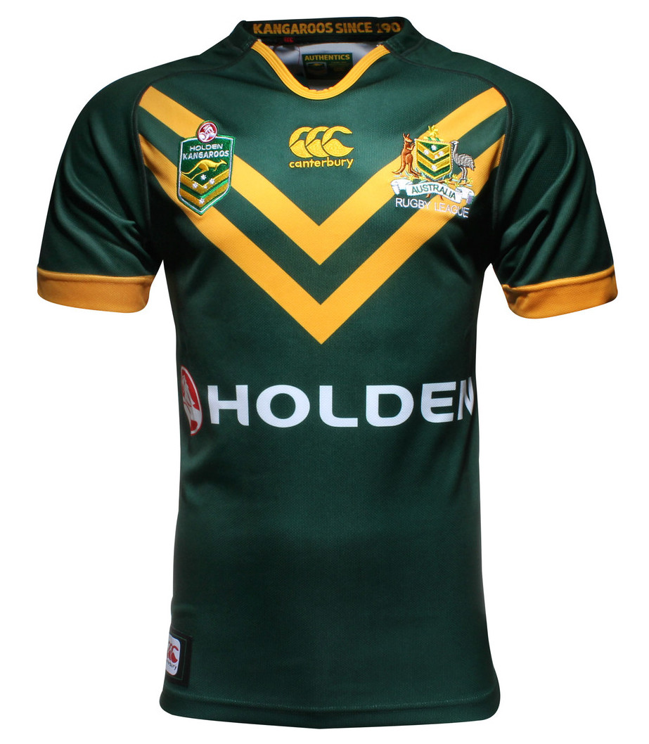
But we’re not here for rugby politics, we’re here for shirts… and if we seem like we’re waffling a little bit before getting into our review of the 2015 Kangaroos shirt, it’s because it’s a rather familiar design. Yup – the 2015 vintage is identical to the 2014 one… which itself was very, very similar to the 2013 shirt…
It’s hard to get annoyed with Canterbury for basically sticking with the same design for three seasons, however. The Kangaroos jersey is one of the most iconic designs in rugby league, and anything that wasn’t a plain dark green shirt with two yellow chevrons on it would basically be sacrilege. There have been very, very few variations on that theme in the last 100-odd years, and those that there have been have generally been awful.

So with that in mind, it’s hard not to just sit back and appreciate what a beautiful take on a classic design this is – the ornamentation has been kept to a minimum, and pleasingly the main sponsor has been shifted down so as not to interfere with the chevron (a pet peeve of modern shirt design).
Canterbury’s designers haven’t kept it so plain that it looks boring however, the little splashes of yellow on the collar and sleeve cuffs add a bit of interest, but other than that, they’ve opted to let a timeless design speak for itself.
The Kangaroos jersey is a lot like the All Blacks one in the sense that if you do anything too radical to derivate from the classic template, you end up doing more harm than good. Canterbury has realised this, and created a classy, clean and respectful take on a icon.
SHIT/GOOD RATING: GOOD


I do love how Canterbury have jut kept it simple and modern at the same time, but for whatever reason I’ve noticed their Australian jerseys in both codes tend to be a little bit less polished than the ones they do for the big national teams up north. Compare this jersey to the England and Ireland ones, and you’ll notice that the latter have rather nice and subtle collars and nice trimmings, whilst the former are completely collarless and are a little less intricate on the detail front.