
The 2015 NRL Auckland Nines tournament brought with it a bevy of one-off shirts that are as varied as they all are consistently bonkers. Let’s dive in and take a look at what was on show at Eden Park this year.
Canberra Raiders
Reminiscent of the awesome Hulk one-off jersey from last season, the Cowboys Nines jersey is a darker, patterned green (much nicer then the lime shade used on the regular NRL jersey for future reference guys) and with white sleeves is our favourite from this year’s showpiece crop… from a distance.
Yes, sadly when you get up close and see that the pattern is in fact an engine, with plenty of turning cogs and belts, which we like on a cheesy level, but just takes away the sheen from what could have been a truly special jersey.
SHIT/GOOD RATING: GOOD…ISH
Brisbane Broncos
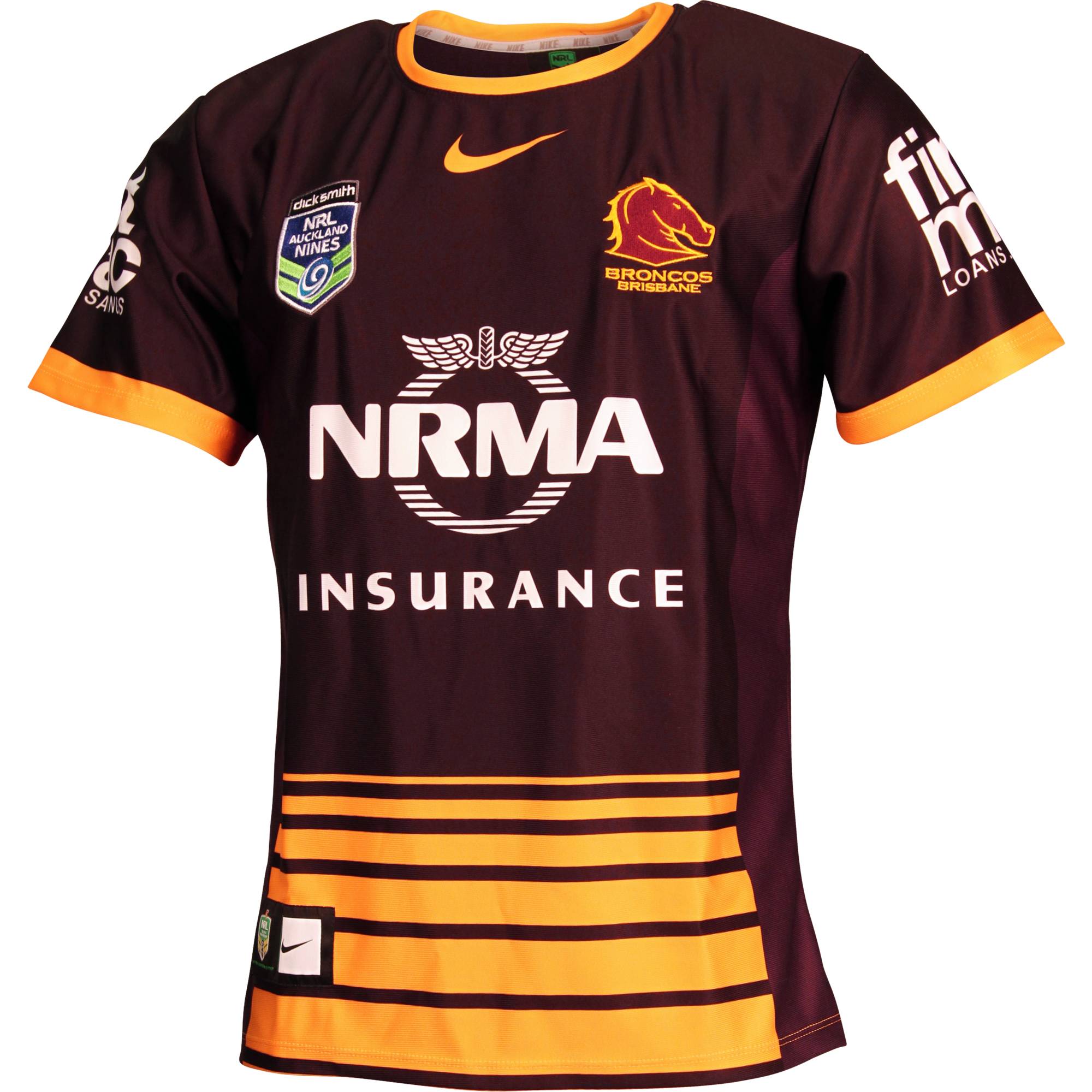
While most clubs approach their Nines jersey with the mission to be as bonkers as possible, the Raiders have gone for a much more restrained affair.
It’s the same basic premise as the rather nice home jersey, but here they’ve opted for a very subtle contrast between darker and lighter shades of maroon between the front and sides of the shirt. With its yellow collar and trim giving the shirt a more coherent vibe than the NRL version, we think we might like it even more than the original!
SHIT/GOOD RATING: GOOD
Canterbury-Bankstown Bulldogs
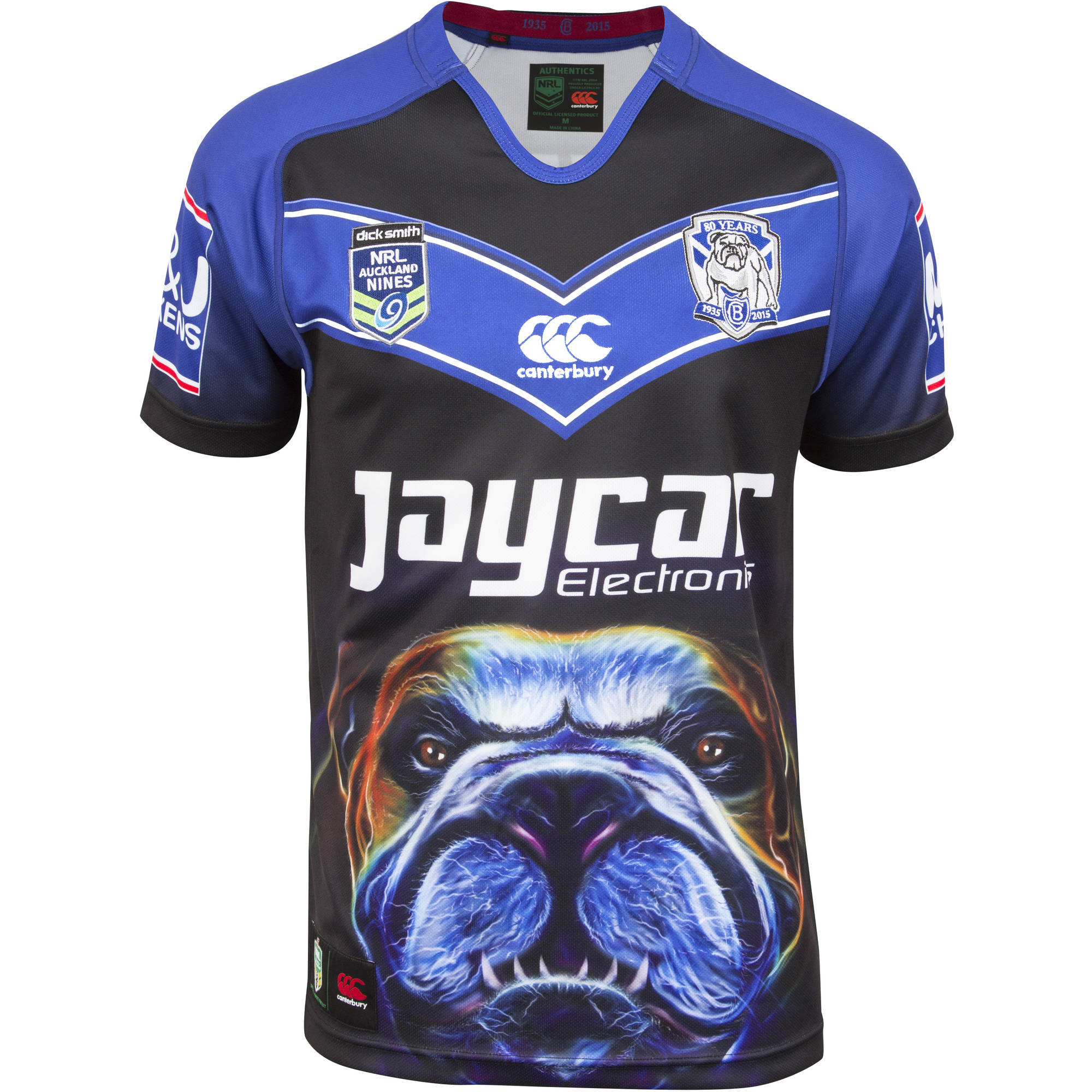
If Canterbury (the kit supplier) have gone for classy understatement on the Bulldogs’ regular season jerseys, clearly they must have been hitting the lager hard at the office Christmas party the night before they designed Canterbury (the club) their Auckland Nines jersey.
The slightly curved blue chevron on black at the top is exquisitely Canterbury (the logo), but subtlety be damned when it comes to slobbering gurn at the bottom. Rather than the proud, well-behaved fellow adorning the Canterbury (the club) badge, the teeth-baring, growling (we suspect) menacing bulldog glaring out at you as if you’re a prime cut of fillet is scary enough to give Frank Pritchard the shakes.
Of all the crazy jerseys for this year’s Nines, this one takes the biscuit and frankly we have to say we love it because we’re genuinely afraid that the bulldog will rip our nads off if we say otherwise. .
SHIT/GOOD RATING: GOOD DOG
Manly Warringah Sea Eagles

In its short history, the NRL Auckland Nines shirts have rapidly surpassed even the World Rugby Sevens shirts in terms of outright craziness… and perhaps none is more crazy than this.
Framed by plain white sleeves, the main body gives no doubt as the Sea Eagles’ vicinity to the beach, with a surfer walking through the blue surf at dusk. The streaks of yellow, purple and orange in the sky take us straight to Summer Bay, with the dots adding a touch of impressionist George Seurat to proceedings.
Fun, bold and downright lovely, its everything a shirt for the Nines should be, and frankly we’d much rather see the Manly troops in this every week.
SHIT/GOOD RATING: GOOD
Melbourne Storm

While most teams have put out training vests in recent seasons (you notice only Australian teams do it – let’s be honest most British teams haven’t got the right training conditions to wear vests) the Storm have decided this is how they’ll approach this year’s Auckland 9’s. Sleeves be damned, the Storm will play up to the fact that they hail from AFL country with this navy number.
With purple stripes on the top and silver below it definitely lacks a bit of cohesion, and while we’re loath to criticise the fine work of the Salvos, their red logo just makes for an unfortunate colour mashup. It’s not the prettiest, but we’re giving the Storm props for rewriting the rulebook on what to wear on a rugby field. Maybe there’ll be boob tubes next year?
SHIT/GOOD RATING: GOOD
Gold Coast Titans
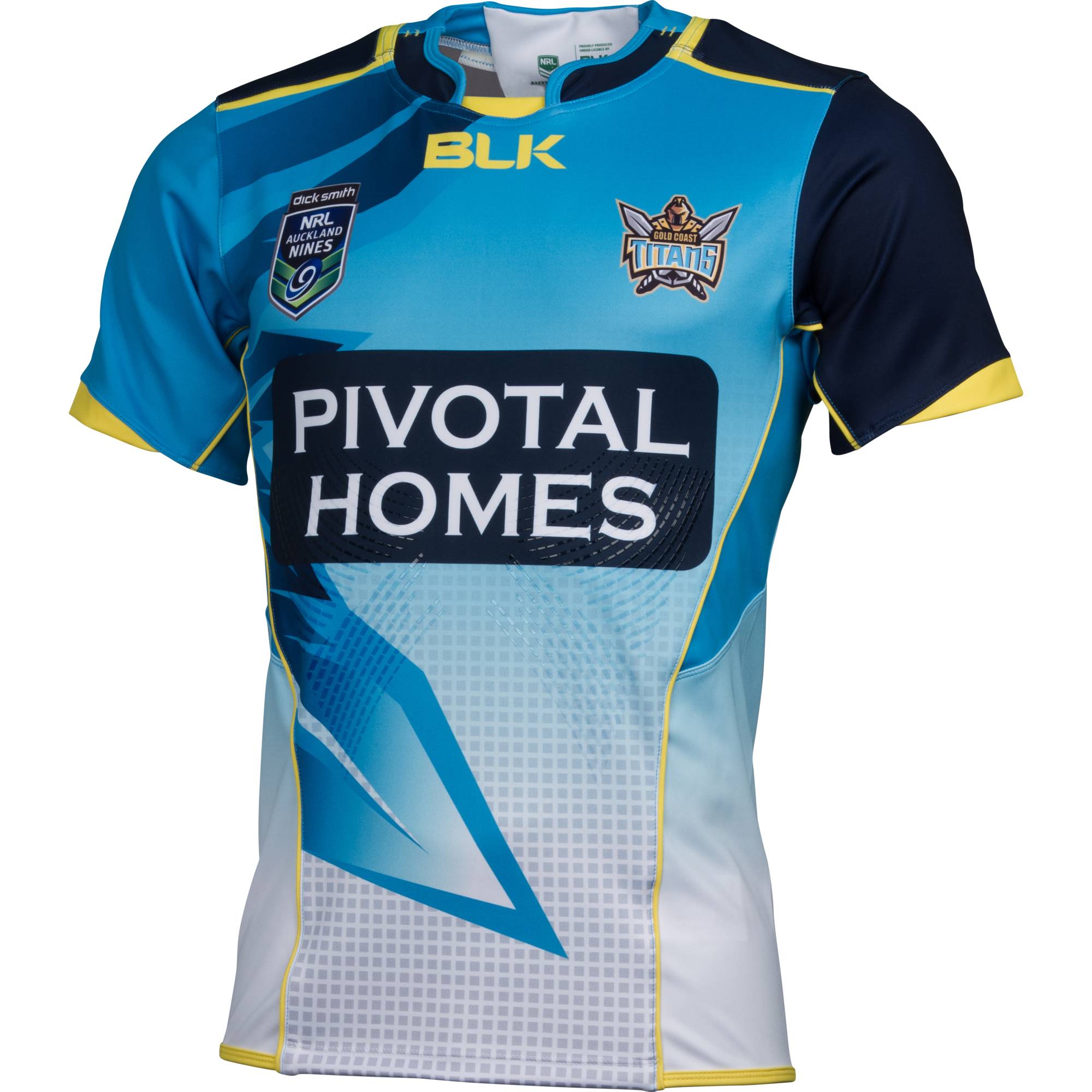
A far cry from the bloated regular season tops, this is a lovely, somewhat lopsided number from BLK. The upper half is a mix of vibrant colours and flashes of yellow trim, while we really like the different coloured sleeves, with the darker left reminding us of a gladiator’s armour.
The bottom half meanwhile fades to white, with a pattern of grey square dots and a big old sword point from the team’s badge coming in diagonally from the left. There’s admittedly quite a lot going on, but with a really nice cut bringing it all together. Not perfect, but we’ll take it over the regular strip.
SHIT/GOOD RATING: GOOD
Cronulla Sutherland Sharks

Being stuck with the plain sky blue jersey most of the time, it’s understandable that XBlades have tried to be a bit extravagant with the Shark’s Nines effort, even if it does give off a whiff of being thrown together in five minutes by a designer influenced by his toddler’s doodles. Big wavy lines of black, blue and white form the basis of the jersey and indeed it looks quite nice on the sleeves, but looks a bit sloppy elsewhere.
It’d be a competent addition to the Nines roster if it was left at that, but the inclusion of some fading white lines in the bottom left and a host of razor sharp black triangles – we’re assuming they represent shark’s teeth – jutting out all over the place end up looking like an oncoming cold front coming behind a wave of heavy rain on the weather forecast.
SHIT/GOOD RATING: SHIT
Newcastle Knights

Our hatred of union’s Crusaders’ chain-mail shirts, particularly the grey away one, is known throughout Christendom, so perhaps we come at the Knights’ on-the-nose Nines jersey from ISC with a bit of bias. Admittedly this is much nicer than the aforementioned affront to chivalry, with its rather intricate medieval imagery over the armour plates, blue and red team collars framing the shoulders and cheeky ‘Call to arms’ motto on the inside collar.
But let’s not beat around the bush, this is still horrible. The cut of the armour imagery makes the shirt look incredibly unbalanced, with the sponsor sticking out like a sore thumb, while the goblet-esque shape on the back even worse than the front. No, just no.
SHIT/GOOD RATING: SHIT
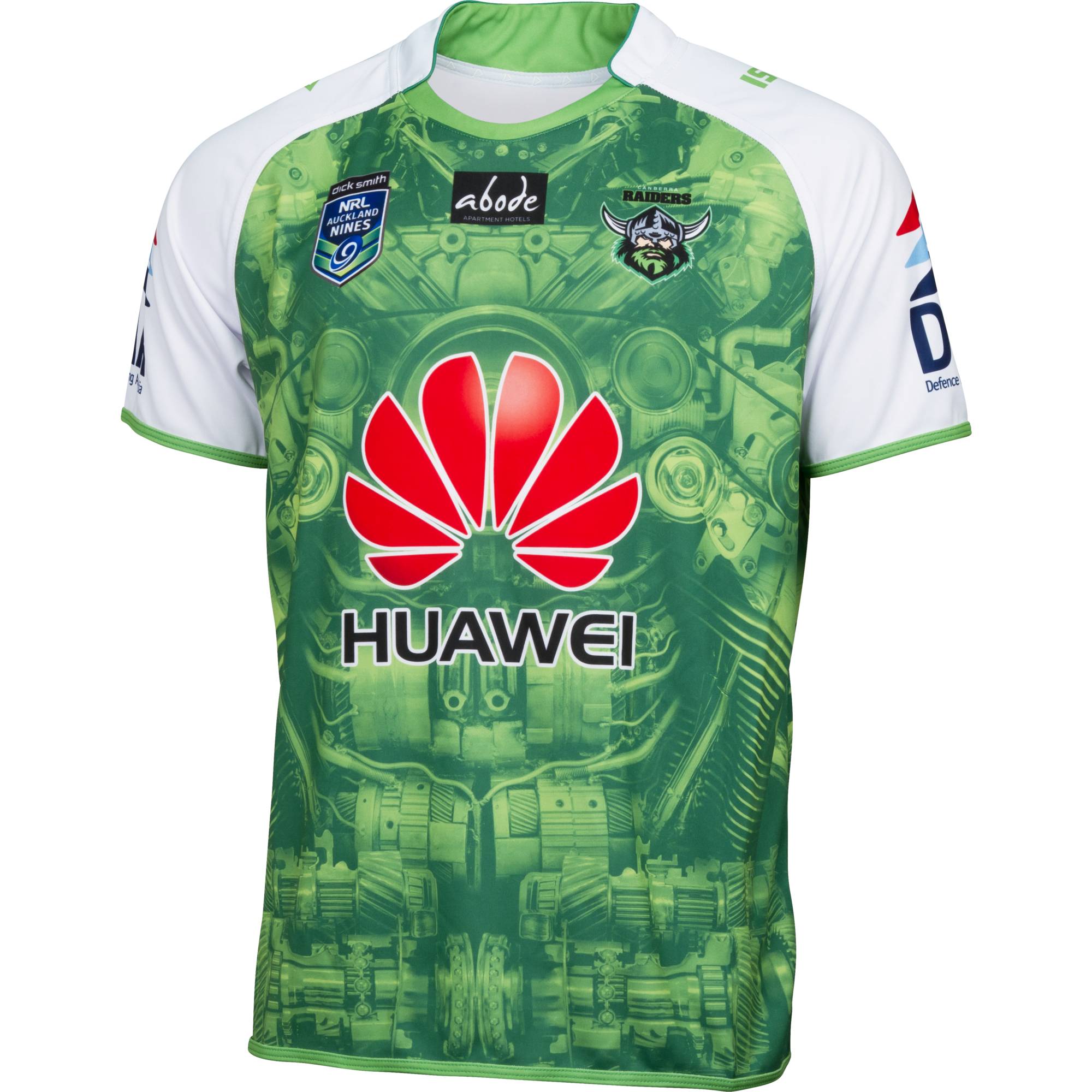
North Queensland Cowboys

Last year’s Auckland Nines winners usually provide some of our favourite jerseys in the NRL, which is why our heads are scratching a little bit with this one from ISC. We like the idea of the chevron pattern running down the middle of the shirt, framed as it is very nicely but the stark white sleeves and colour and dark blue armpits.
However, we’re at a loss as the why the top 20% of the chevrons are light blue, while a line across the bottom third separates the navy and light blue again. Add that to the rather generous cut at the bottom, which makes the shirt seem rather floatier than the tight designs we prefer, and it’s a bad start for the Cowboys’ defence of their title.
SHIT/GOOD RATING: SHIT
Paramatta Eels

Another Nines jersey that firmly uses the team’s name to absurd effect. The basic yellow shirt with blue side panels and trim makes for a nice background, while the snaking white bands cleverly add two nice divisions for a bit of fun. Yes, the blue and yellow pattern of the Eels’ emblem are the clear focal point here, but by being limited to the top and a small segment in the bottom right, they don’t overwhelm the jersey, allowing the strong shirt below to stand out. What could have been a garish monstrosity befitting a day out in Cardiff on a Saturday night, turns out to be pretty decent.
SHIT/GOOD RATING: GOOD
Penrith Panthers
The Penrith shirts from ASICS are some of the strongest in the league due to their simplicity. This approach is taken with the Nines jersey, with a white reverse of the home jersey, black trim and a light brown tinge to the small strips that run across it – it’s far more prevalent on the back.
And then raaar, right in the middle are three tears coming through the shirt via a swipe of a black panther’s claws. Obviously we know this from the menacing eye staring through at us and the tips of the claws poking through. If we’re honest the claws themselves seem a little skinny to be a big cat – rather lizardy in fact – but that’s a minor quibble on what is a strong shirt with an added bit of drama.
SHIT/GOOD RATING: GOOD

South Sydney Rabbitohs

The reigning NRL Premiers will hope to start 2015 as they ended last year and do so in one of the simplest but nicest shirt in this year’s Nines. Utilising the Bunnies’ trademark green and red stripes neatly against a predominant white background, this adds a real touch of style to the Nines flamboyance.
It’s not totally traditional, however – the keen-eyed among ypu will notice a subtle pattern sublimated into the the jersey. This is actually the koru motif – a key element of Maori art, and a nice nod to the tournament’s host nation. Clean, classy and classic, we really like this number from ISC. Bravo chaps.
SHIT/GOOD RATING: GOOD
St George Illawara Dragons

If ever there was a competition of a sponsor ruining a jersey, this is the Nines nomination, Ordinarily the Red V’s jerseys are the height of dullness, so it’s great to see them sporting this bad boy. We’re a big fan of the black shoulders and red trim, while that silver dragon crowning the chest and torso is a real thing of wonderfully silly beauty.
But that silly green St George dragon of the logo facing looks so awful just inches from a real fearsome mother, you just wonder if they could have dropped him from the shirt just for this occasion. Such a shame.
SHIT/GOOD RATING: SHIT
Sydney Roosters

The Bondi Boys’ Nines jersey is very similar to their good but not great third jersey from last year. However, whereas the red, white and blue stripes were almost evenly shared on that one, this one takes the blue and the white to form thicker stripes across the shirt, with red trim on each.
It’s definitely a case of less is more, with this lovely, clean design confirming again that stripey rugby shirts are rarely less than gorgeous.
SHIT/GOOD RATING: GOOD
New Zealand Warriors

The hosts of the Auckland Nines and kings of the glorious or gaudy in NRL have again got Canterbury to pull out all the stops on this beauty, named after Tangaroa, the Maori god of the ocean. The tribal designs of the bottom half –including a white pointer shark design on the body of the jersey that ‘reflects movement, speed and travelling’ – look stunning on the stony dark blue, looking like something the elves may have carved in Middle Earth.
The top half however is pure New Zealand, with the Warriors’ logo displayed across the chest, coloured in with the enchanting effect of pāua shell, a decorative shell used in Maori culture. Whether you’re a kiwi or not, you’d have to be a sour mollusc not to be captivated by this fabulous shirt.
SHIT/GOOD RATING: GOOD
Wests Tigers

Joining Melbourne in going for the AFL vest approach, Wests are the only team to have two Nines jerseys, one black and one orange. The former is a fairly simple affair, with the latter employing a few highlights including black side panels and collar, with white trim on the sleeves.
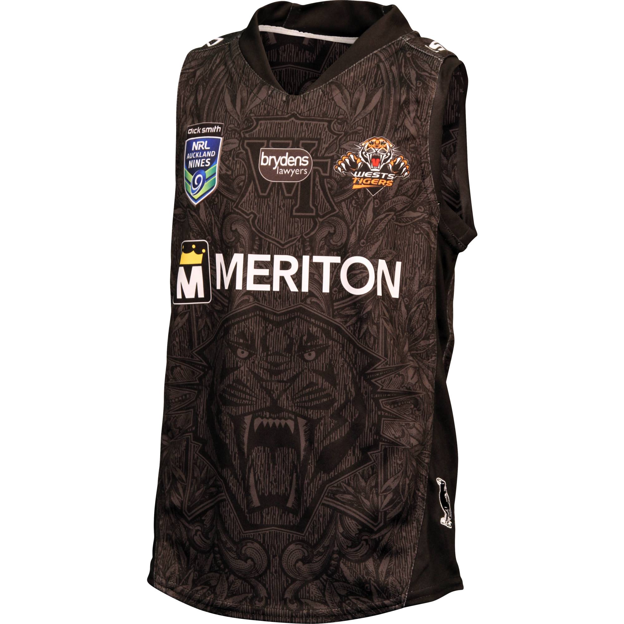
However, both contain the same striking tiger image and decorative leaves that add to the distinctive flavour, doing the patterned approach a lot better than the engine of the Raiders or the Knights’ medieval armour. Likewise, it might not be as on the nose as the Panthers’ utilisation of the big cat gimmick, but it’s all the better for it.
SHIT/GOOD RATING: GOOD
Well there you have it – every 2015 Auckland Nines shirt reviewed and rated! Keep checking back with us for reviews of all the new NRL shirts for the 2015 season.


