

The Rugby World Cup is nearly upon us, and after four years of hype and build-up, it won’t be long before we can forget about all the pre-tournament silliness and focus on the actual rugby.
Before we can do that, however, there’s still some important things to be decided. With Namibia finally pulling their fingers out over the weekend, all the RWC2019 jerseys have finally been launched and that means we can at long last decide who has brought their A-game in the shirt stakes, and who had better hope they play better than they look.
Four years ago when we did this for RWC2015, this feature somehow turned into a mammoth four-part every-shirt countdown, which frankly, was a bit silly. So this year we’re not bothering talking about the moribund middle of the pack – you know who you are – and are instead focussing on the the jerseys that are set to live long in the memory for both good and bad reasons.
Of course, if you want to decide for yourself, or indeed tell us we’re wrong, you can check out all the new RWC2019 jerseys in our full round-up here. In the meantime, however, let’s get stuck in to the Official Rugby Shirt Watch Best (And Worst) Jerseys Of Rugby World Cup 2019…
THE WORST
IRELAND ALTERNATE
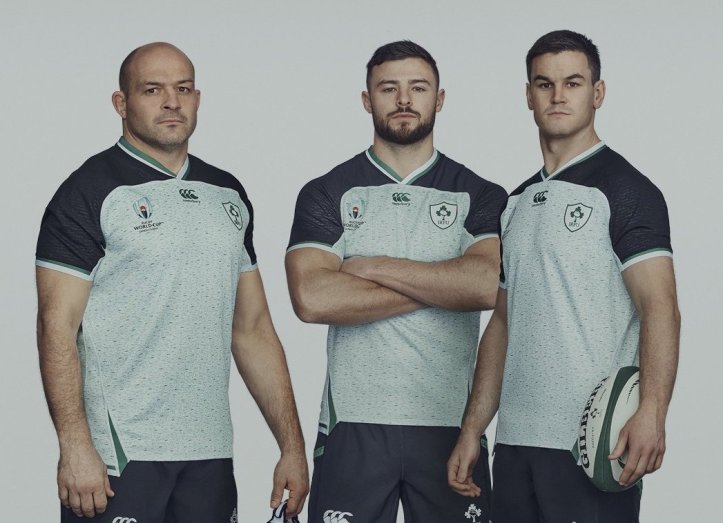
Look, there’s a reason that everyone in the picture above looks unbelievably pissed off, and we suspect it has a lot to do with being forced to wear the most hideous jersey in the competition.
The horrible green and white speckled pattern to the body, the badly contrasting black shoulders and sleeves, the general vibe of a rejected training jersey… it’s really just a mess. If Ireland end up having to wear this in a likely quarter-final against South Africa, they should be made to forfeit the game.
URUGUAY HOME

Look, we don’t like to pick on the little guys, but seriously Uruguay, 1996 called, and they want their ugly jerseys made by brands nobody has ever heard of before back.
The collar is awful, the sublimated pattern on the shirt is tacky, the material of the shirt itself looks like you couldn’t want it going anywhere near an open flame… the World Cup, and Uruguay, deserved better than this.
FRANCE HOME

This jersey SHOULD work, you can tell that it so badly wants to be a gloriously retro homage to the grand old days of French rugby, especially with that new-old FFR crest…
And yet it ends up just going wrong – that weird tabard effect around the chest and shoulders looks weird, the collar looks like its come out of a low-rent teamwear catalogue and the rest just feels like they haven’t even bothered – a common theme at this tournament, we must say.
ENGLAND ALTERNATE

England never really seem to know what to do with alternate jerseys, and too often over the last few years the answer has been ‘fuck it, let’s try EVERYTHING and see what happens’.
The result here is just a mess, however – the heathered red base, the ugly training-shirt vibe of the blue shoulders, and the collar that makes the whole thing look like a weird halter-neck top. No thank you.
ARGENTINA ALTERNATE

Look, this is a controversial one, we know, but take a step back and look at this shirt again – admit it, it’s an absolute shambles of a design.
Fades, vertical stripes, multiple shades of blue, and white, and yellow… and pink. Everyone always loves Argentina shirts, and rightly so, but sometimes they get it wrong and for us, this one just doesn’t work at all.
THE BEST
WALES HOME

Under Armour’s final Wales jersey might be the best in their long relationship with the Six Nations champions. Too often UA’s jerseys have been too plain, too modern, or just a bit weird.
This, however, hits the right balance of everything – it feels classic, but the quartered pattern on the body in different without being polarising, the shield on the badge looks fantastic, and the open collar might be our favourite at the World Cup. Lush.
USA ALTERNATE

The generic nature of some of Canterbury’s jerseys at this World Cup has been a constant complaint among fans, and something thats definitely made it hard to get excited about at times, but the USA’s alternate design really makes the best of it.
The two-tone blue and white look is great, especially with the star-spangled shoulder section, while the red and blue stripes on the sleeves are a lovely touch. ‘Murica indeed.
FIJI HOME

Fiji’s Rugby World Cup jerseys in 2015 were some of the best in the tournament and the home shirt for Japan might be even better.
The ‘tapa’ pattern on the ribcage provides a striking and unique contrast to the classic white jersey on the ribs and sleeve cuffs, while the sublimated pattern on the sleeves themselves is a subtle and classy touch.
JAPAN ALTERNATE
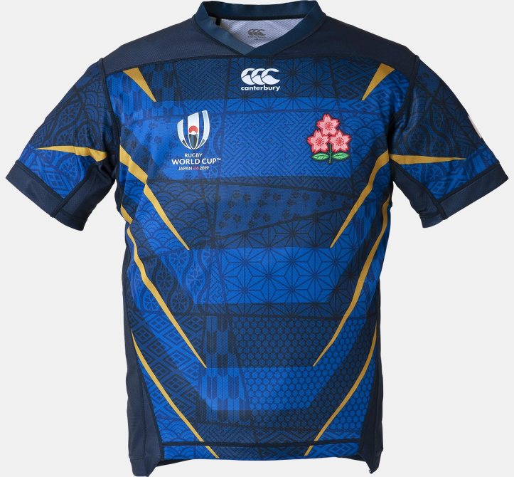
The Rugby World Cup hosts should have a good jersey, and thankfully Canterbury pulled out all the stops to make Japan’s shirts feel as unique as they are lovely.
While the home shirt is great, the blue-on-blue hooped alternate shirt is the real pick of the bunch for us, with the striking sublimated pattern and lovely gold accents, it really is a tour de force.
AUSTRALIA ALTERNATE

Australia don’t usually have much need for an alternate jerseys, and as a result they tend to be quite uninspired when they are forced to have them for the World Cup.
For RWC2019 however, the Wallabies have done something special, in adapting their stunning Indigenous jersey design into a change shirt that not only looks fantastic, but will carry real significance when it’s worn in the tournament.
ARGENTINA HOME

Oh Pumas, all is forgiven. We mean… just stop reading this sentence and go back and look longingly at the image above again. It is just BEAUTIFUL.
Attention other rugby shirt makers, if you want to go ‘retro’, this is now the benchmark of glorious golden era wonderfulness that you must aspire to. The beautiful pale blue and white hoops, the elegant simplicity of the collar, the fact that it has actual real buttons… honestly, if we could take this shirt out and buy it dinner, we would.
It’s just such a crying shame that for reasons we can’t fathom, Nike’s replicas of this shirt don’t come with the classic fold-over collar, and instead have a simple round-neck design.
It’s a tragedy, frankly, because the jersey above is pornographically, wonderfully good – it’s rugby shirt nirvana, and we should all sit back and enjoy it while we can.
So what do you think? Have we got it totally wrong? Have we missed anything out, good or bad? Let us know in the comments below, and if you need to refresh your memory, check out our full RWC2019 jersey round-up here.

